Creutz (&) friends
Visual identity design and ongoing communication
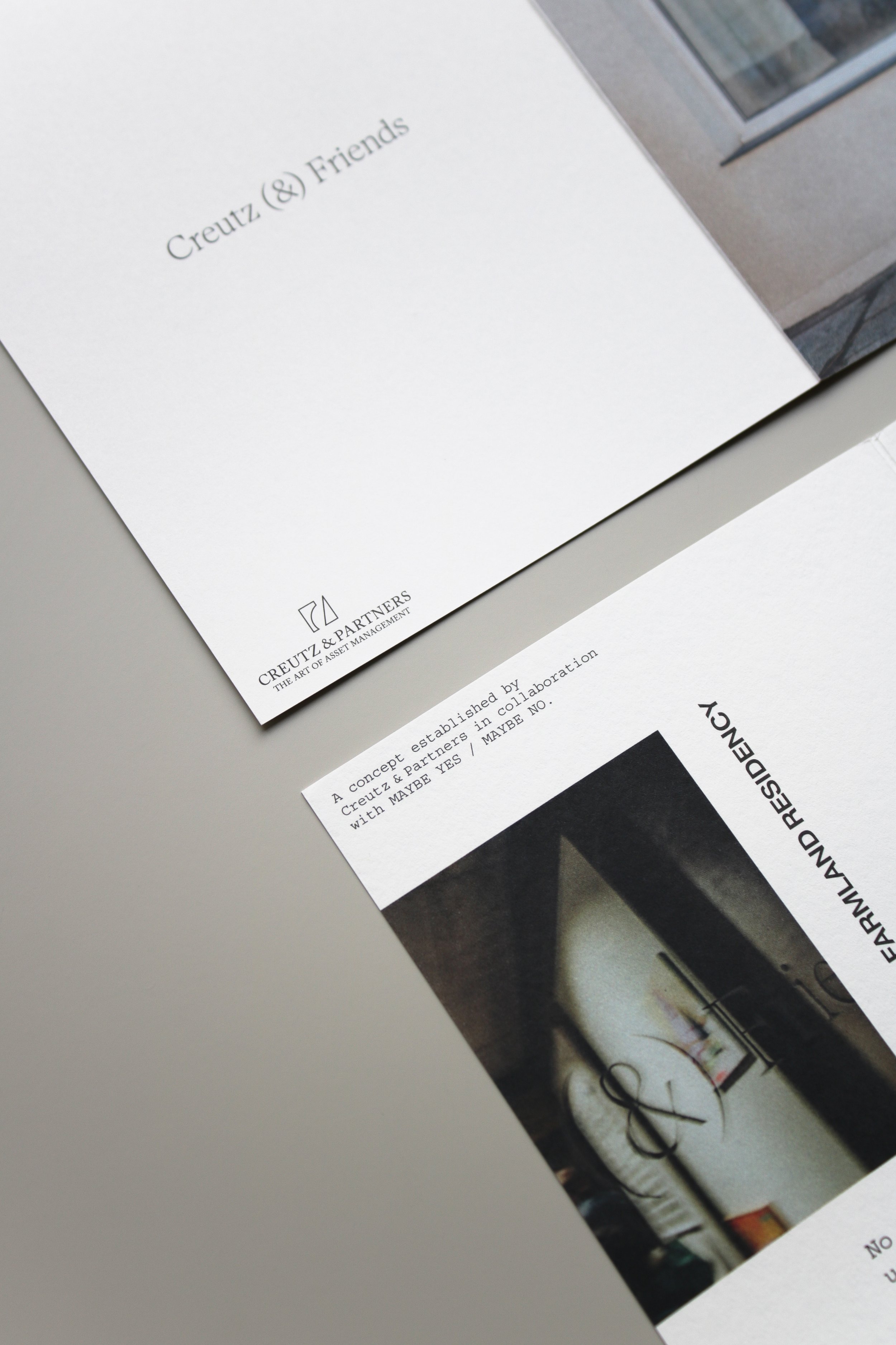
A concept established by Creutz & Partners in collaboration with MAYBE YES / MAYBE NO.
Client : Creutz & Partners
2023
Project images © Studio Abricot
Space photography and images on exhibitor cards © Tom Jungbluth photography
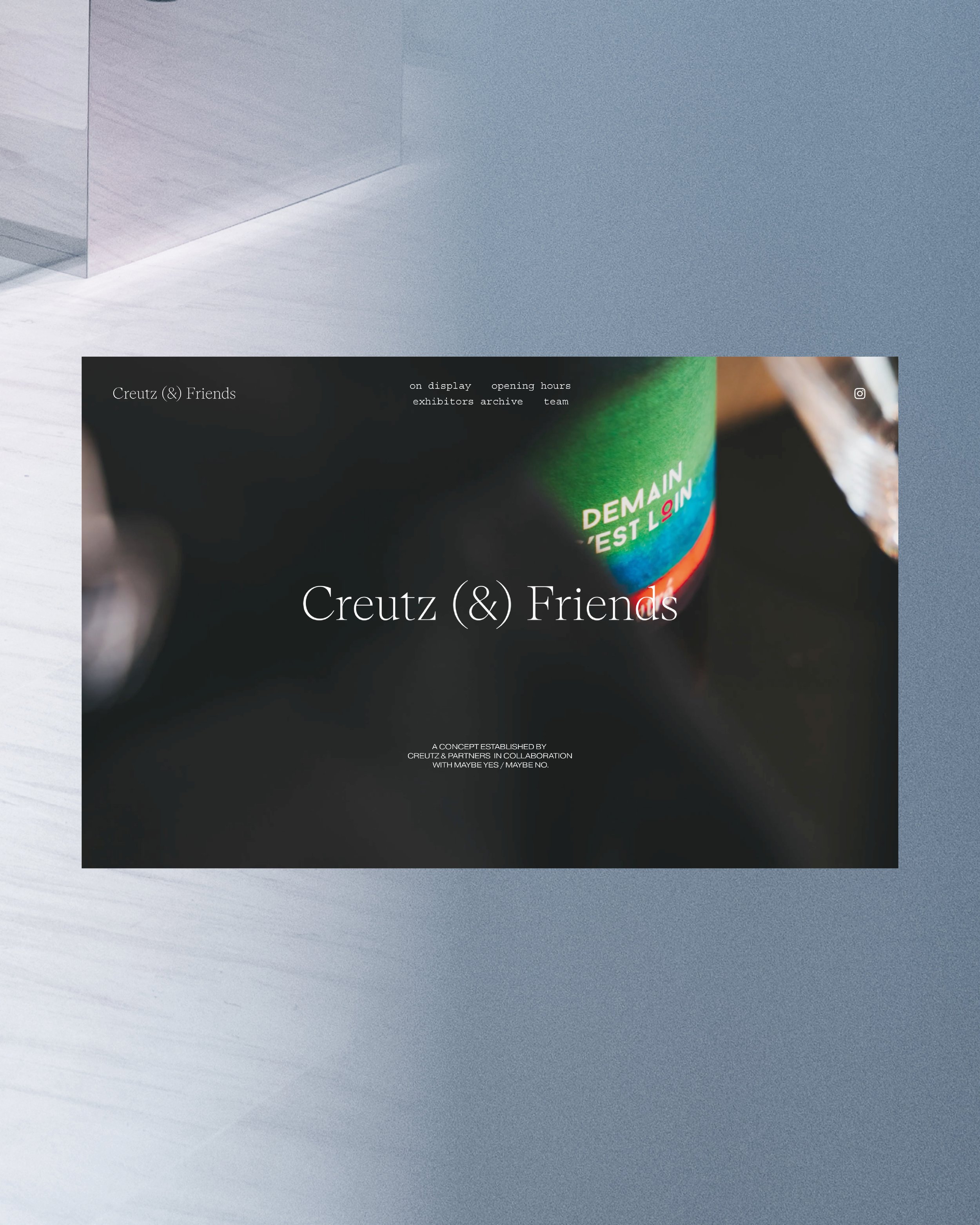
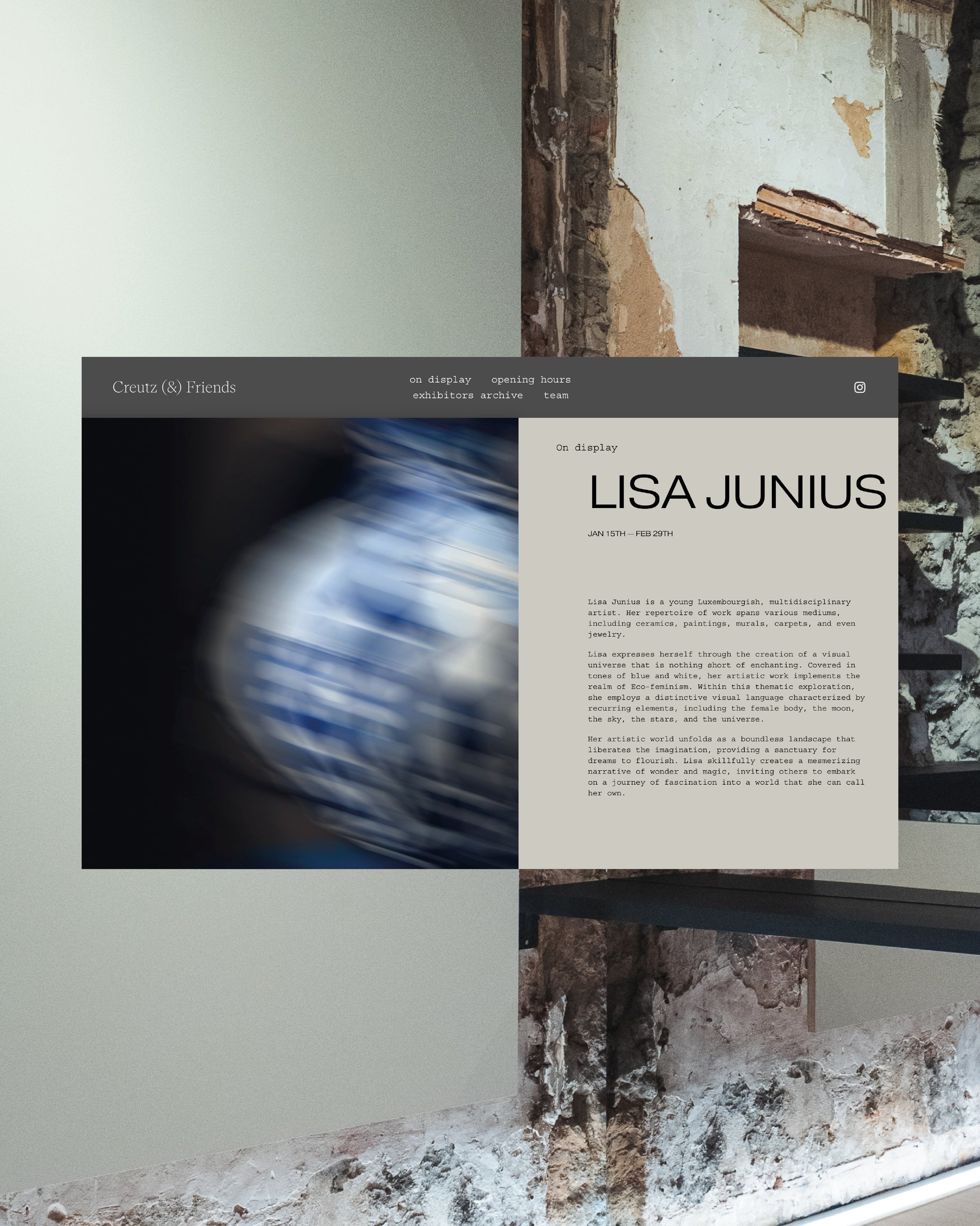
Website visualisation stills © mehl+wasser production
Creutz (&) Friends is an exhibition concept established by the Luxembourgish asset manager Creutz & Partners with the aim of promoting selected entrepreneurs in various creative fields.
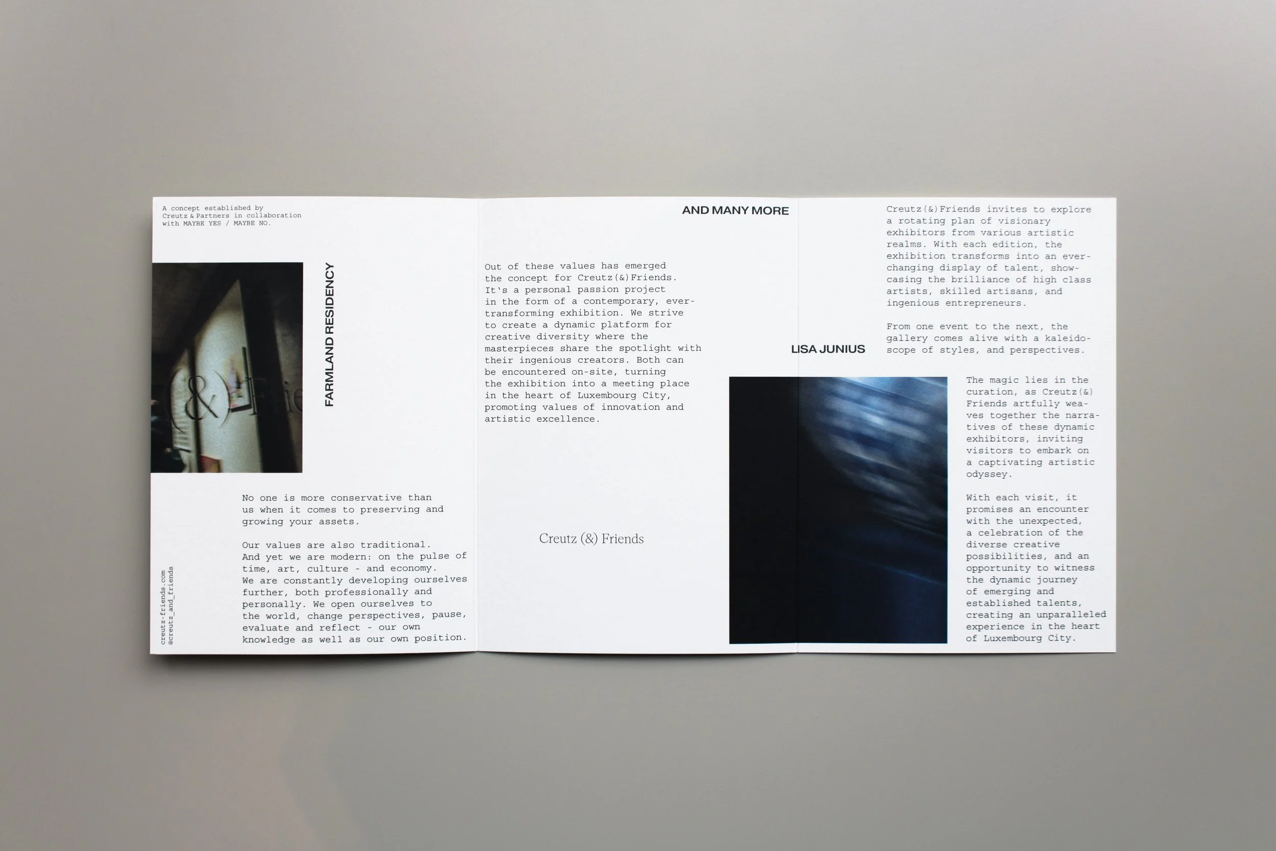
Creutz(&)Friends invites to explore a rotating plan of visionary exhibitors from various artistic realms. With each edition, the exhibition transforms into an ever-changing display of talent, showcasing the brilliance of high class artists, skilled artisans, and ingenious entrepreneurs. From one event to the next, the gallery comes alive with a kaleidoscope of styles, and perspectives, creating an unparalleled experience in the heart of Luxembourg City.
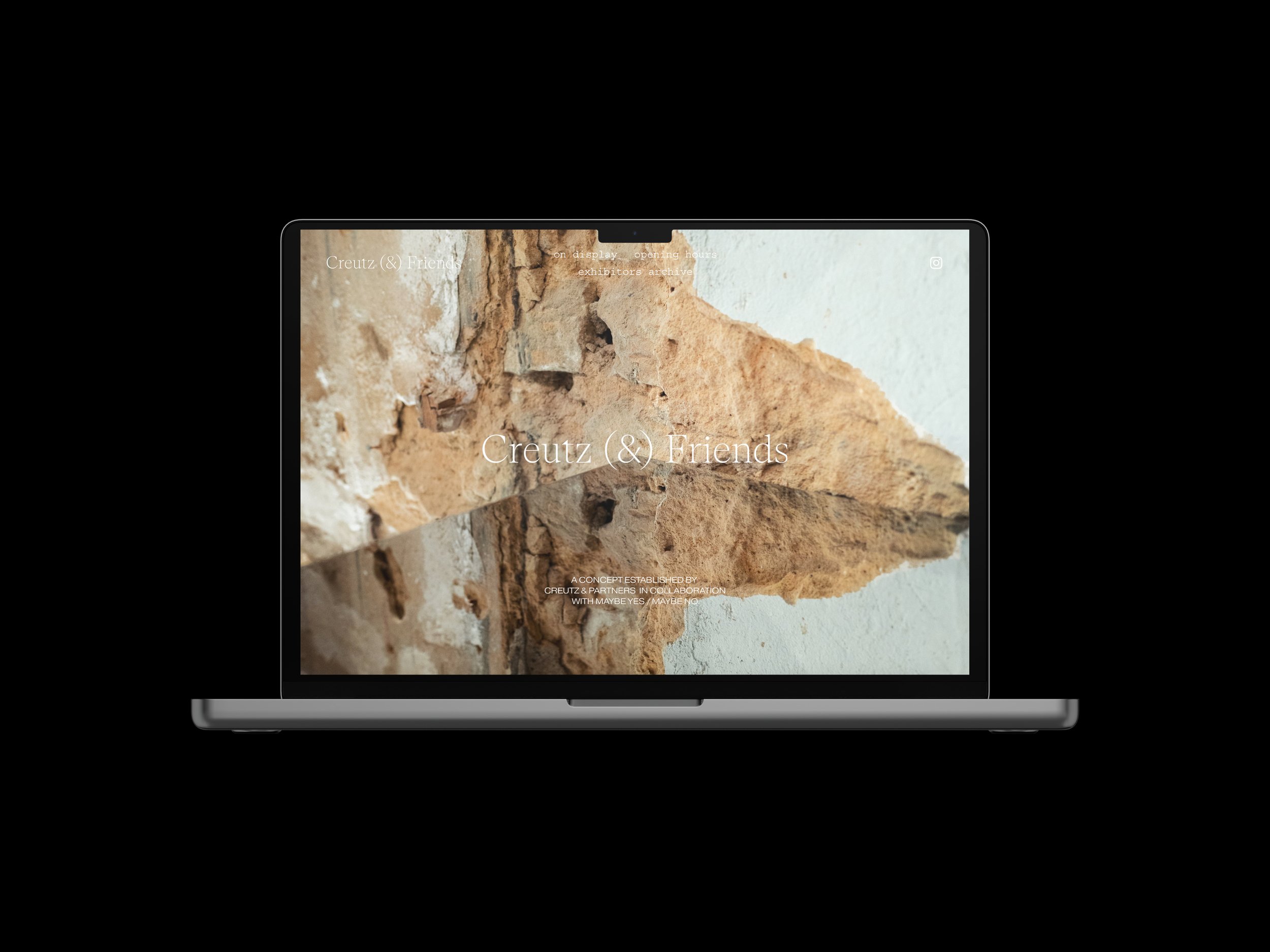
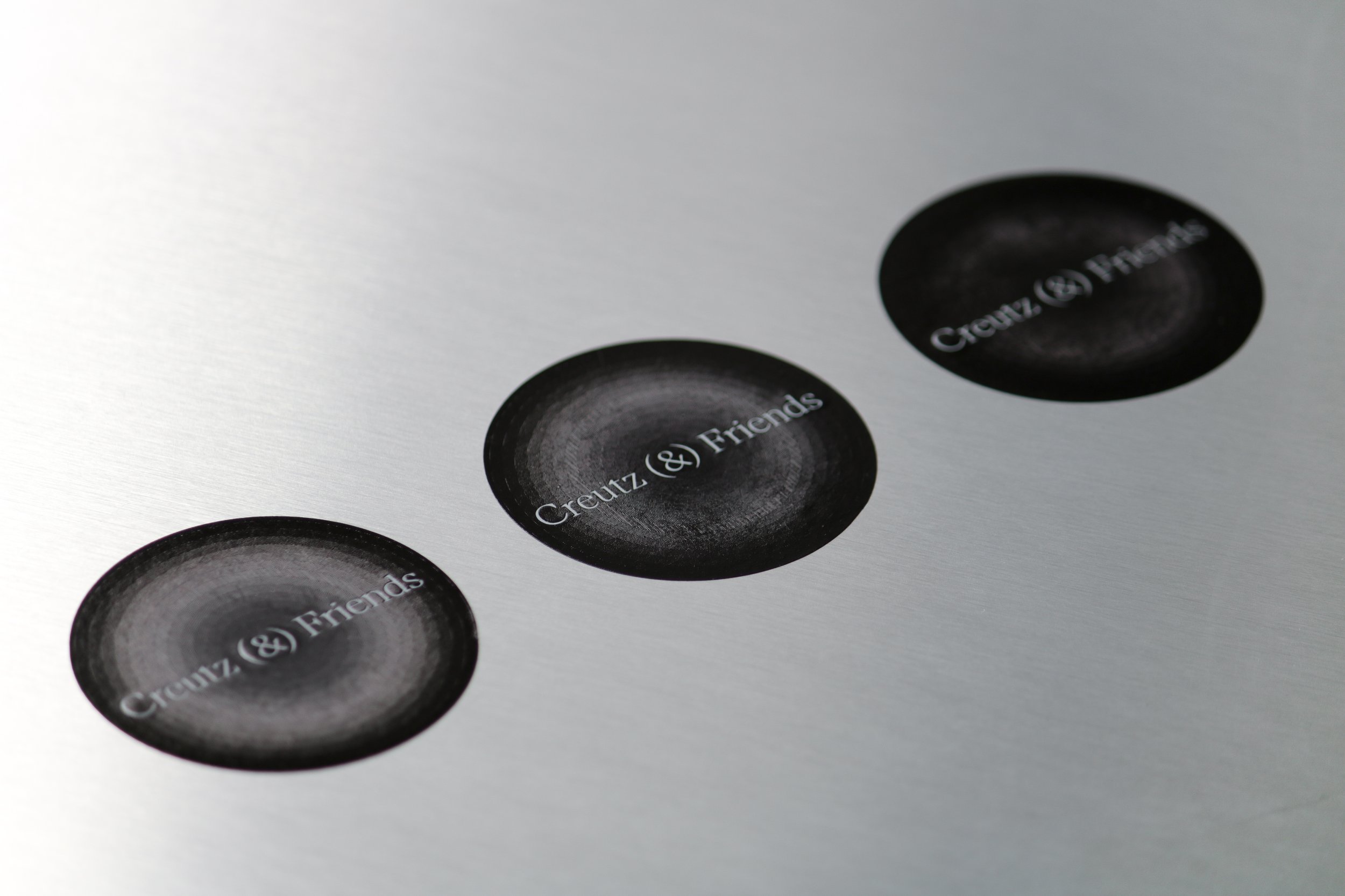
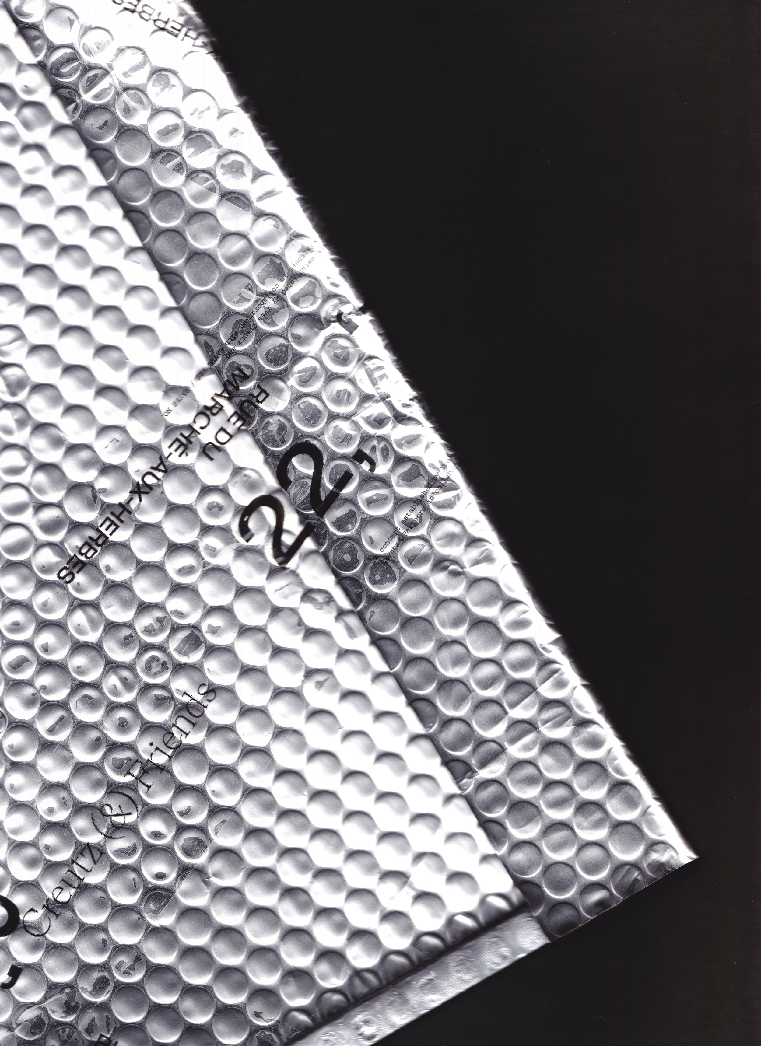
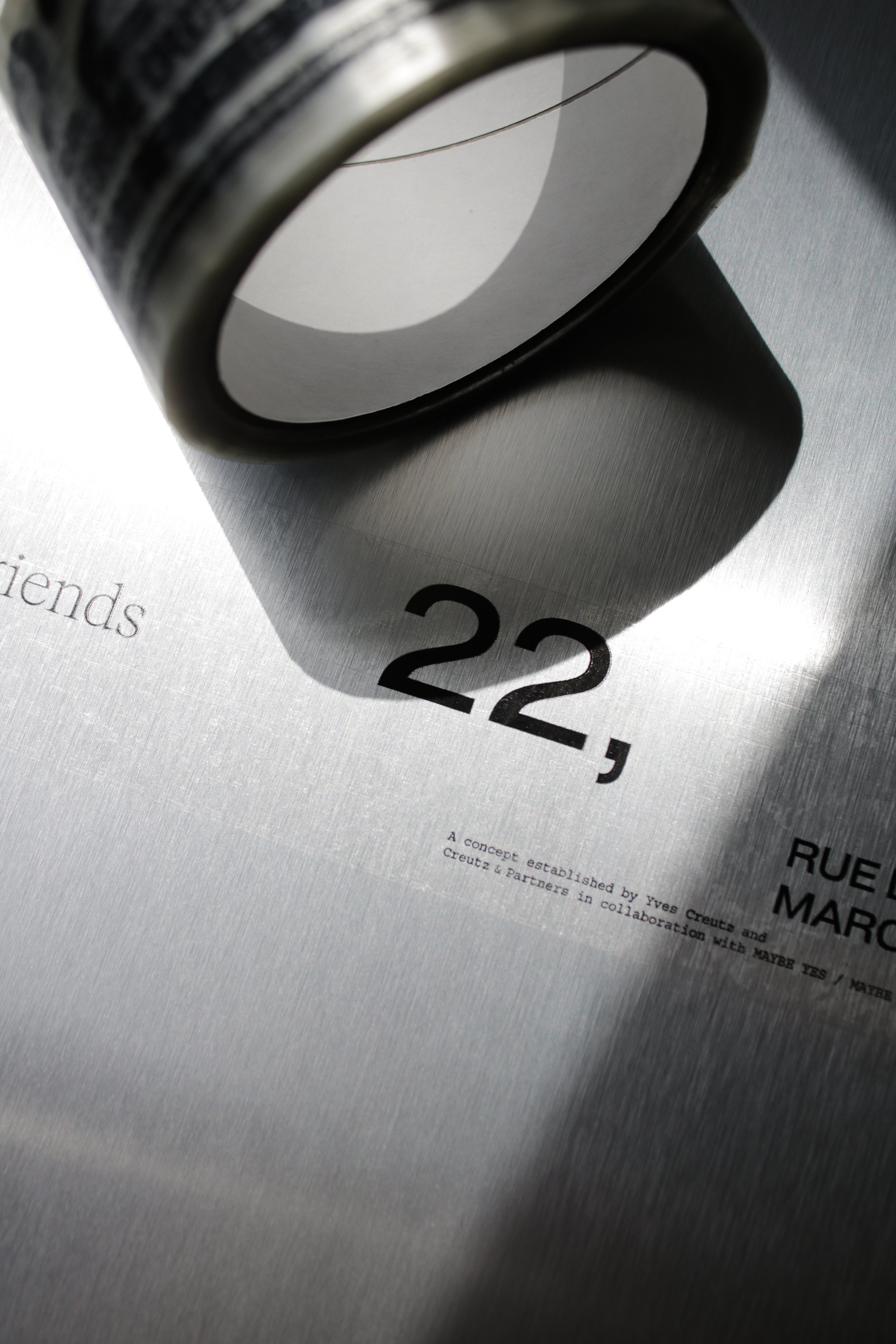
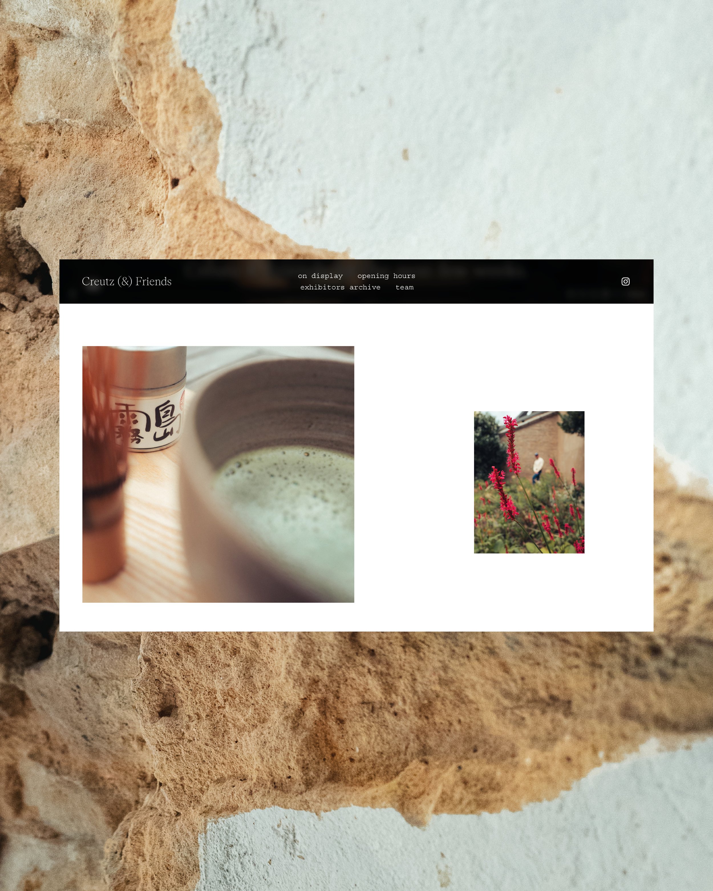
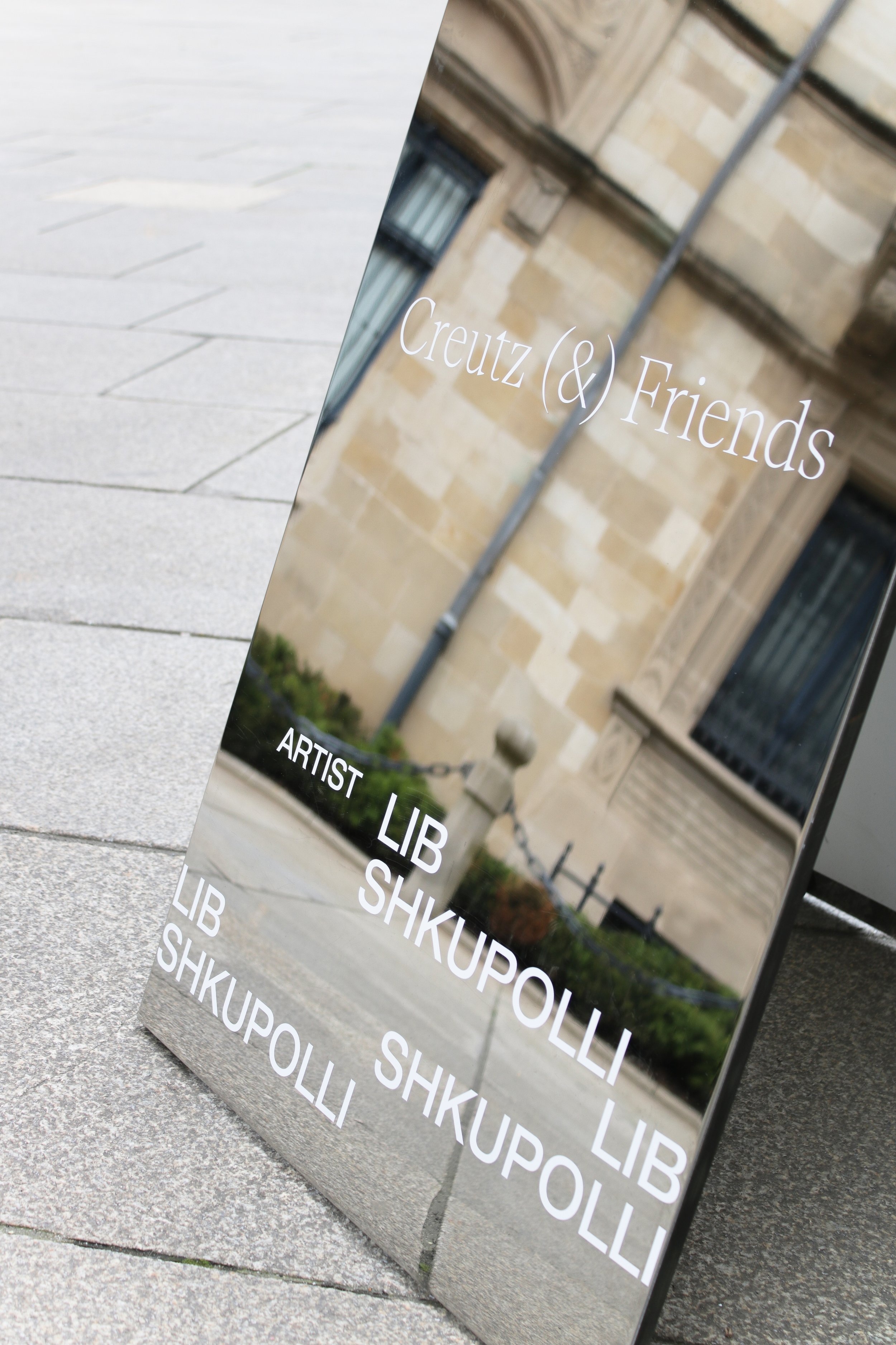
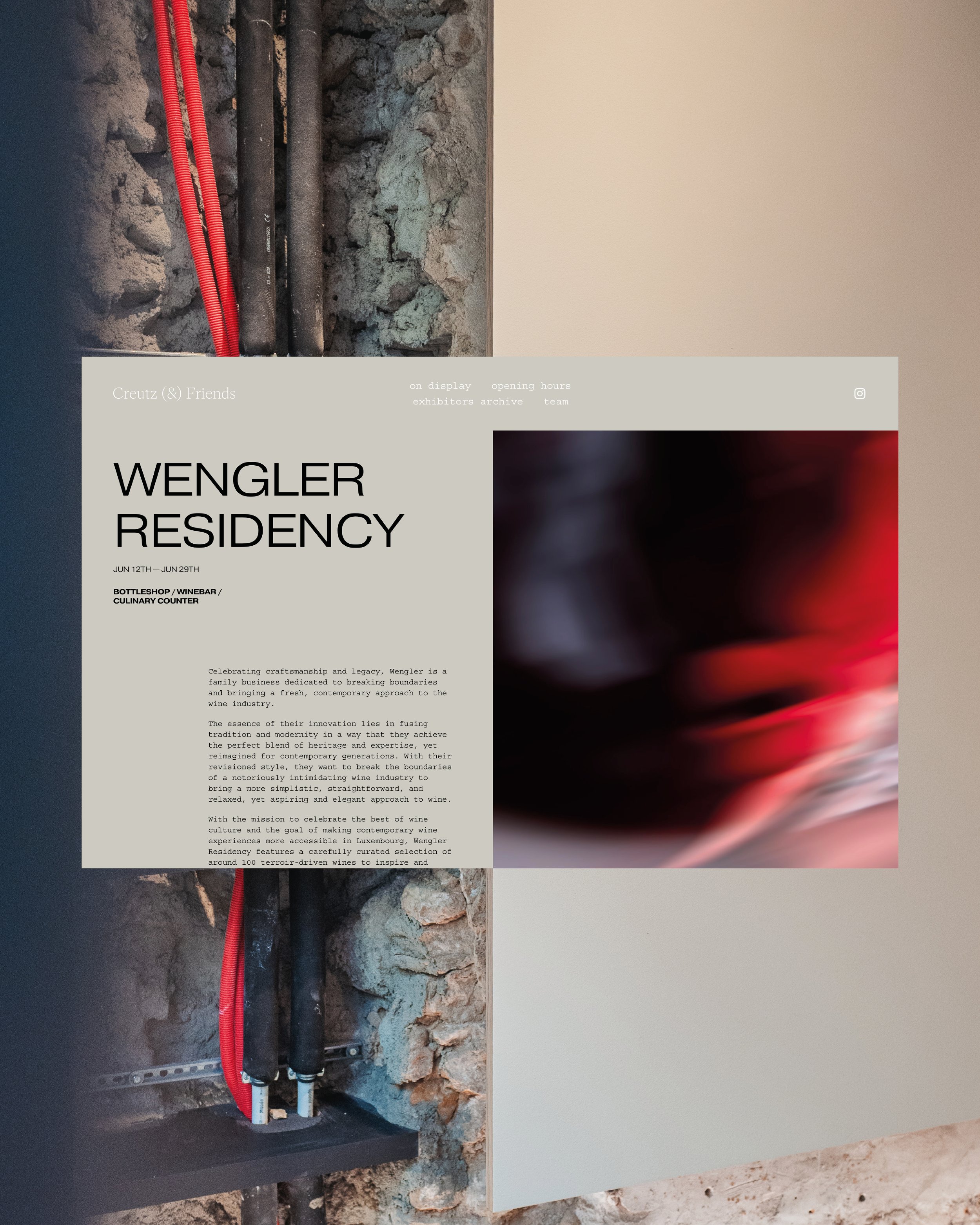
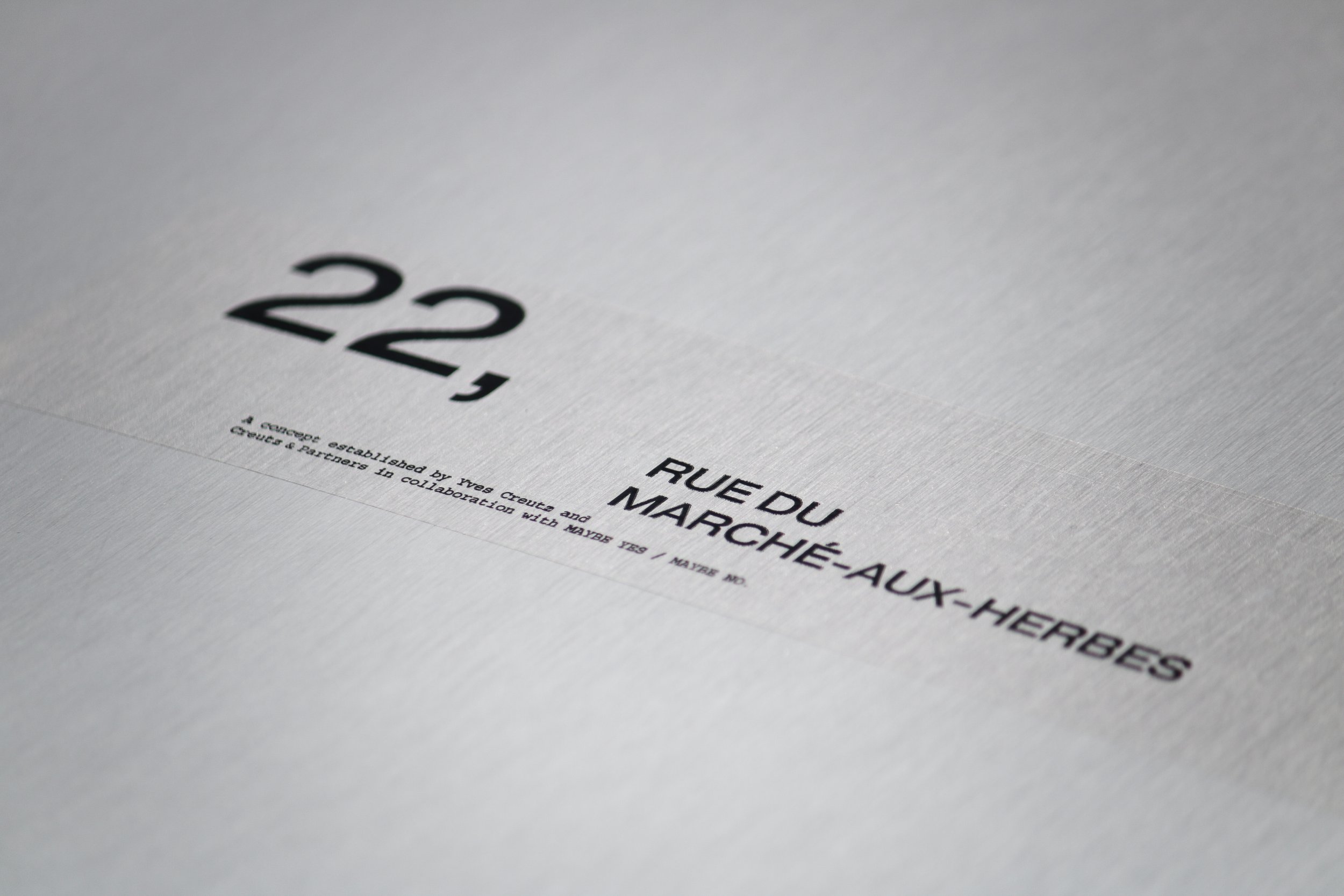
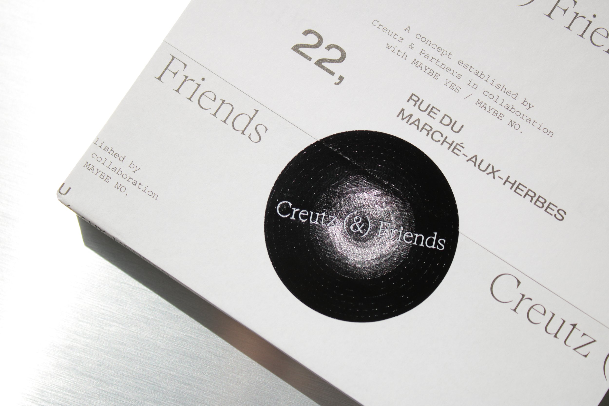
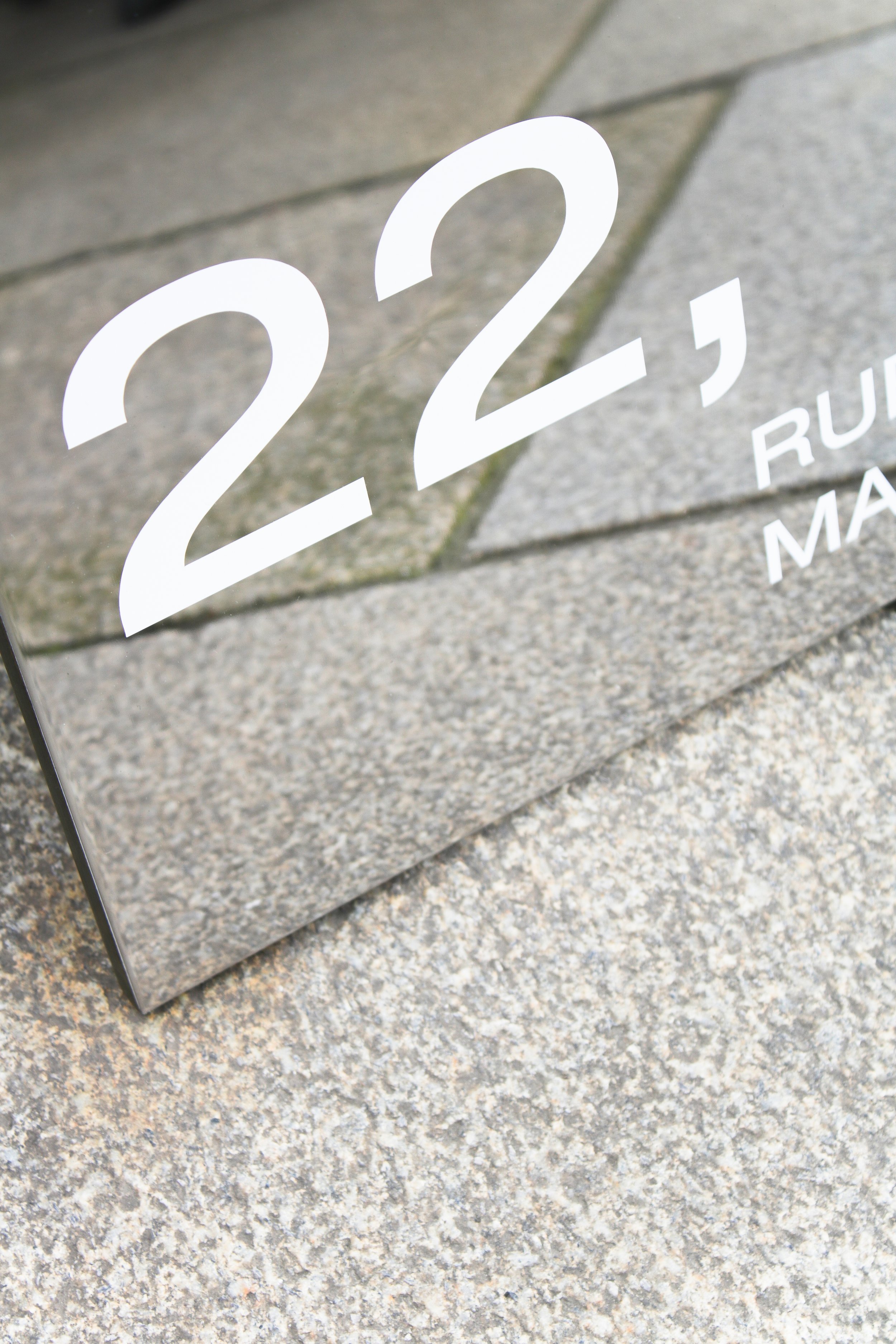
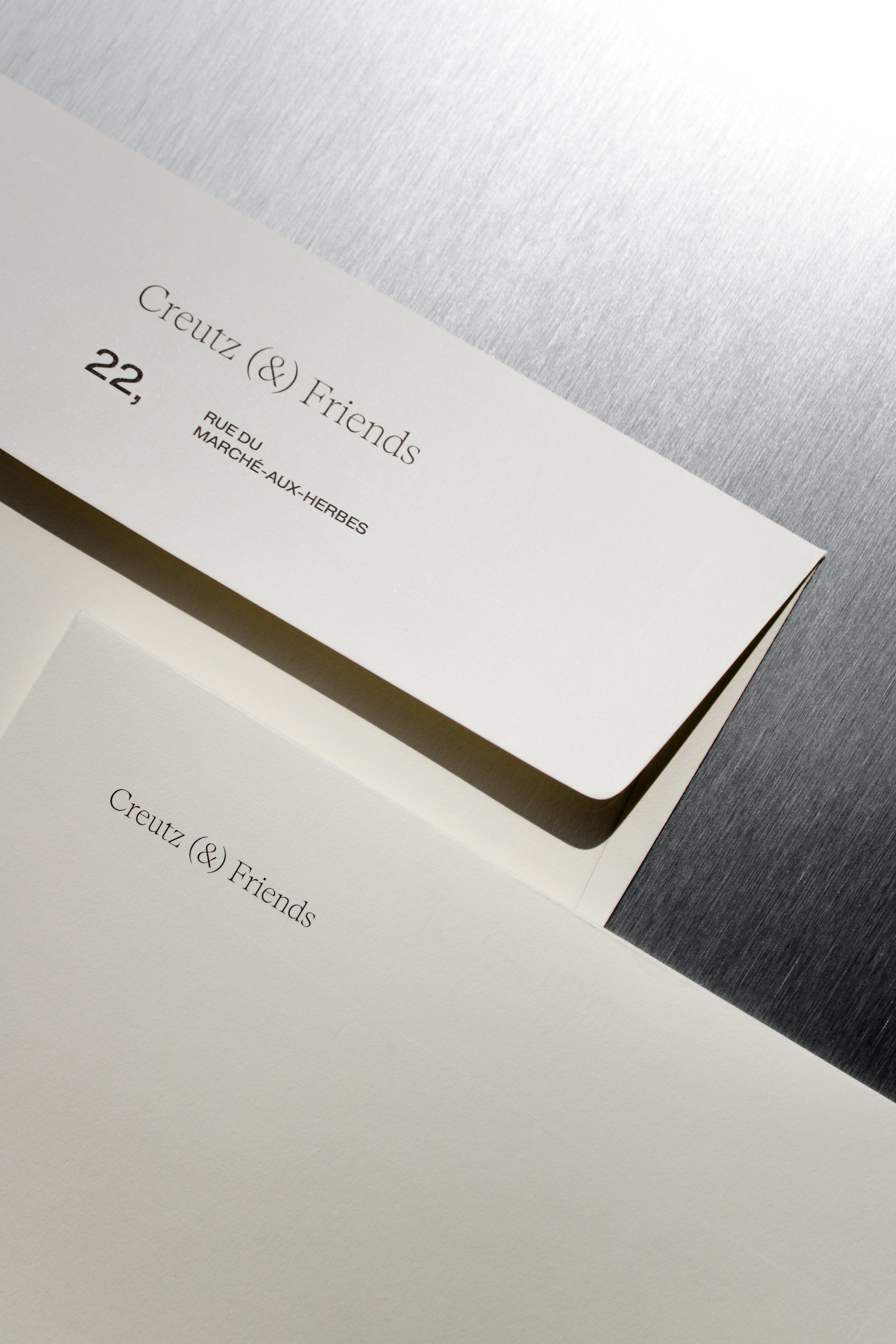
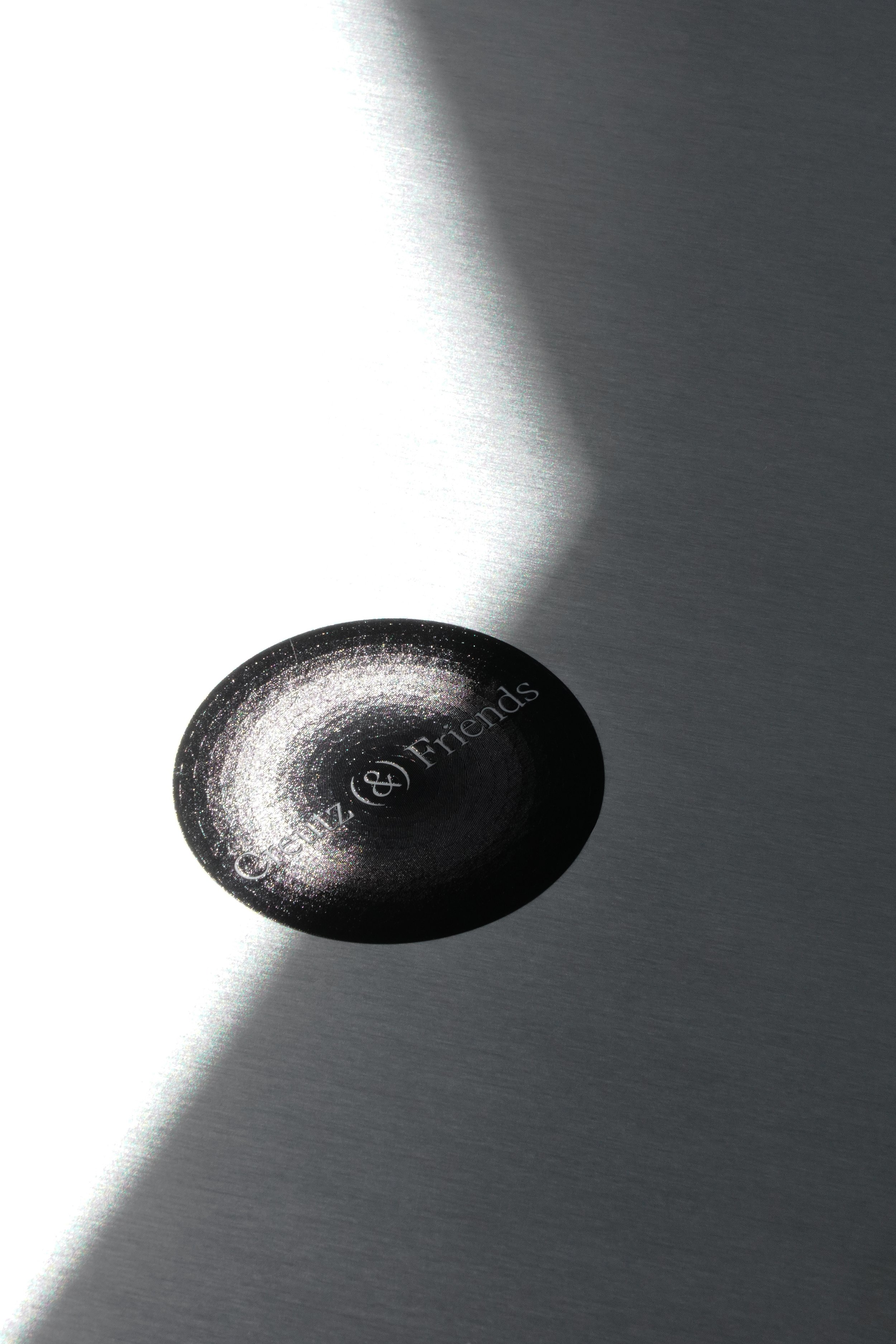
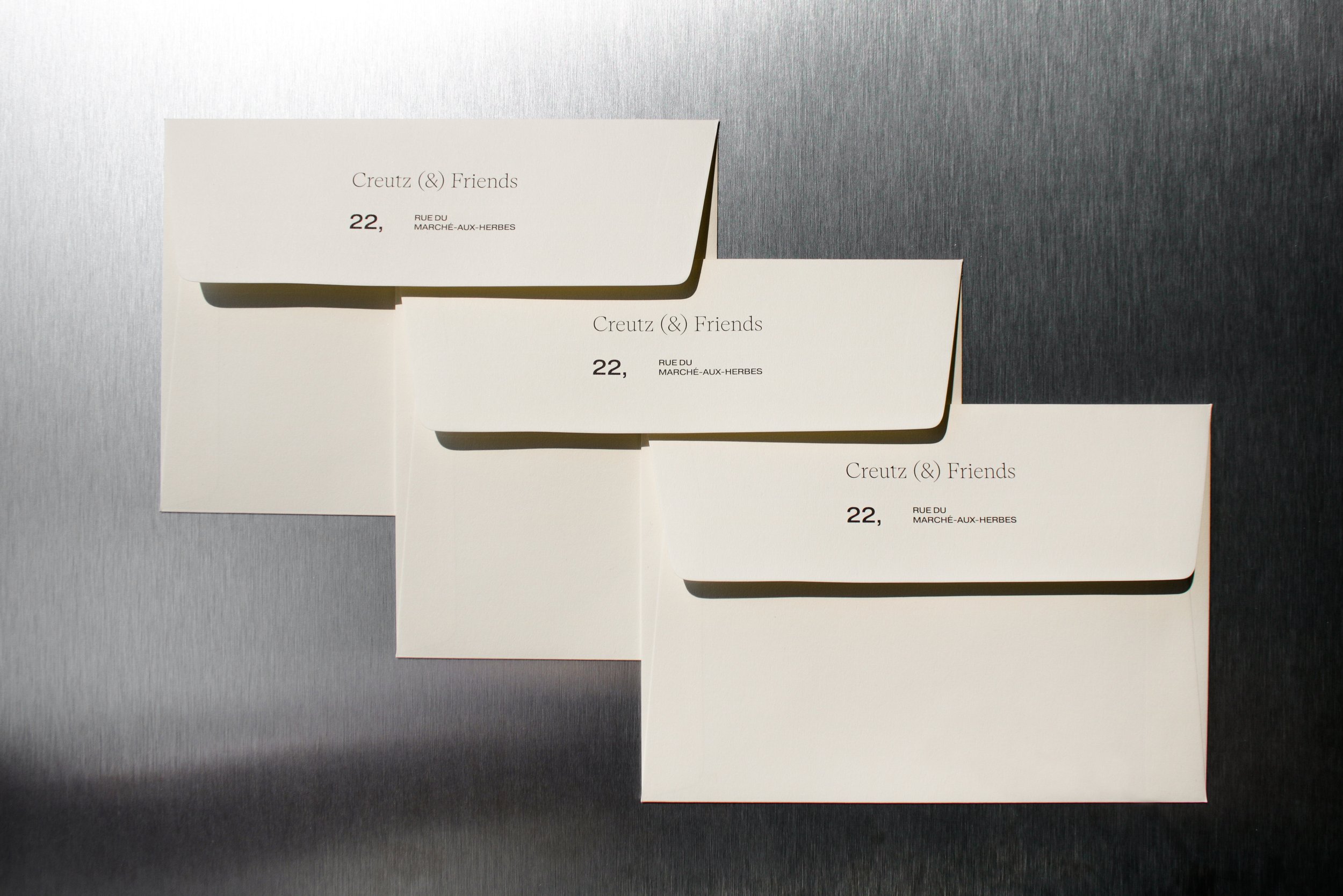
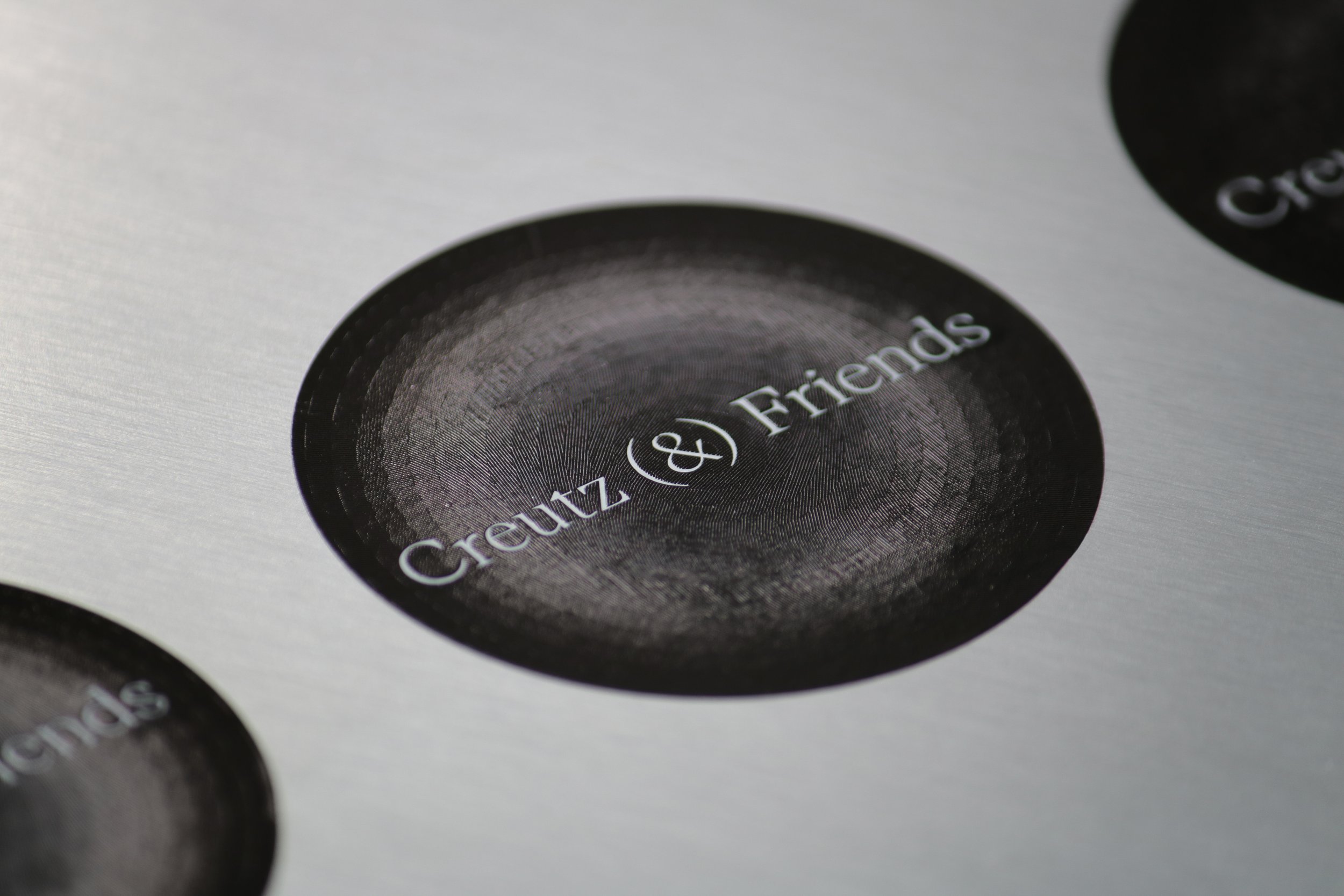
The visual identity was thoughtfully designed to mirror the physical transformations of the space. Originally present materials were combined with new complementary ones. Following this principle, the exposed plaster and travertine tiles were deliberately retained, while modern elements such as reflective stainless steel were added to create a contrast to the natural textures and colors of the stone and walls.
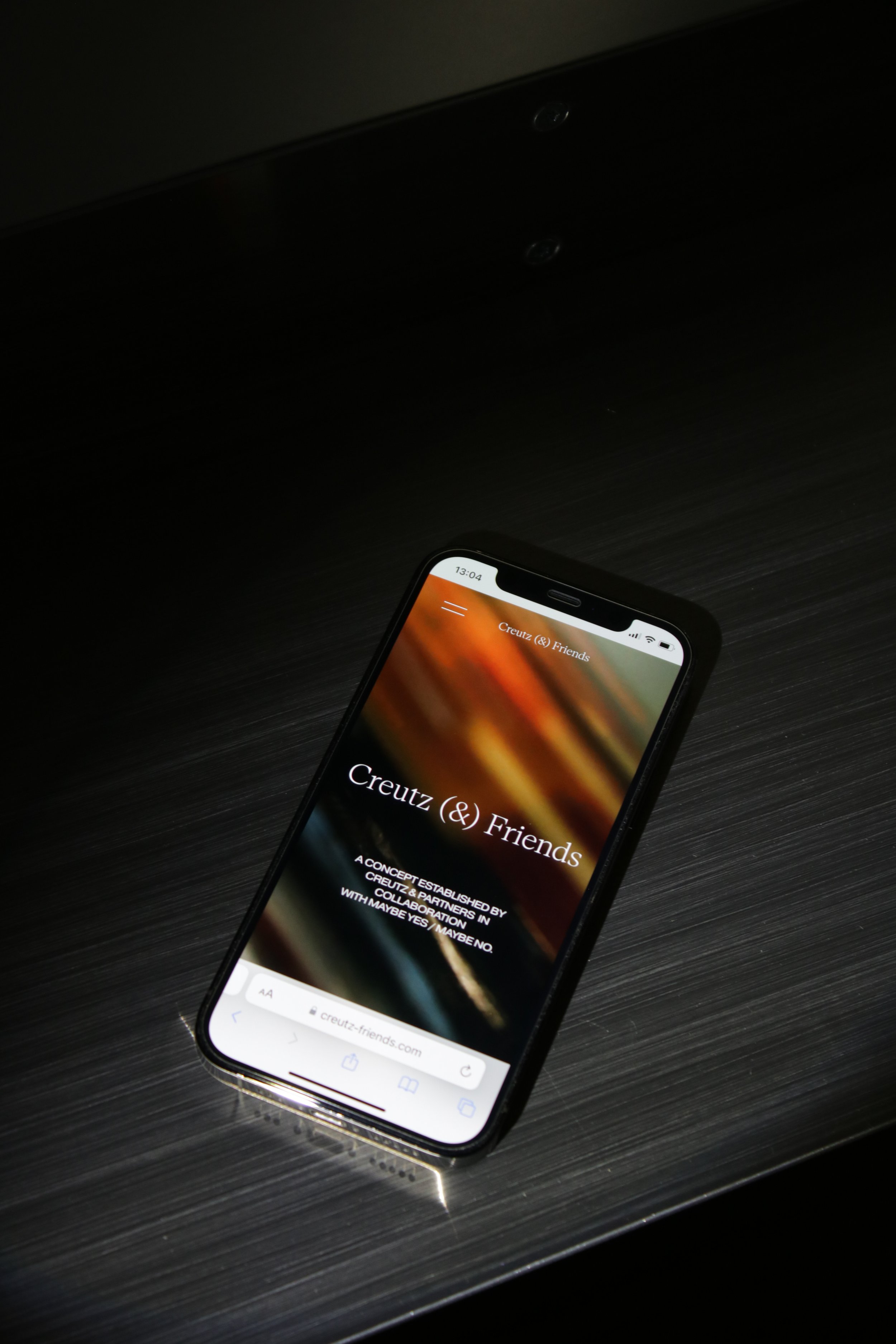
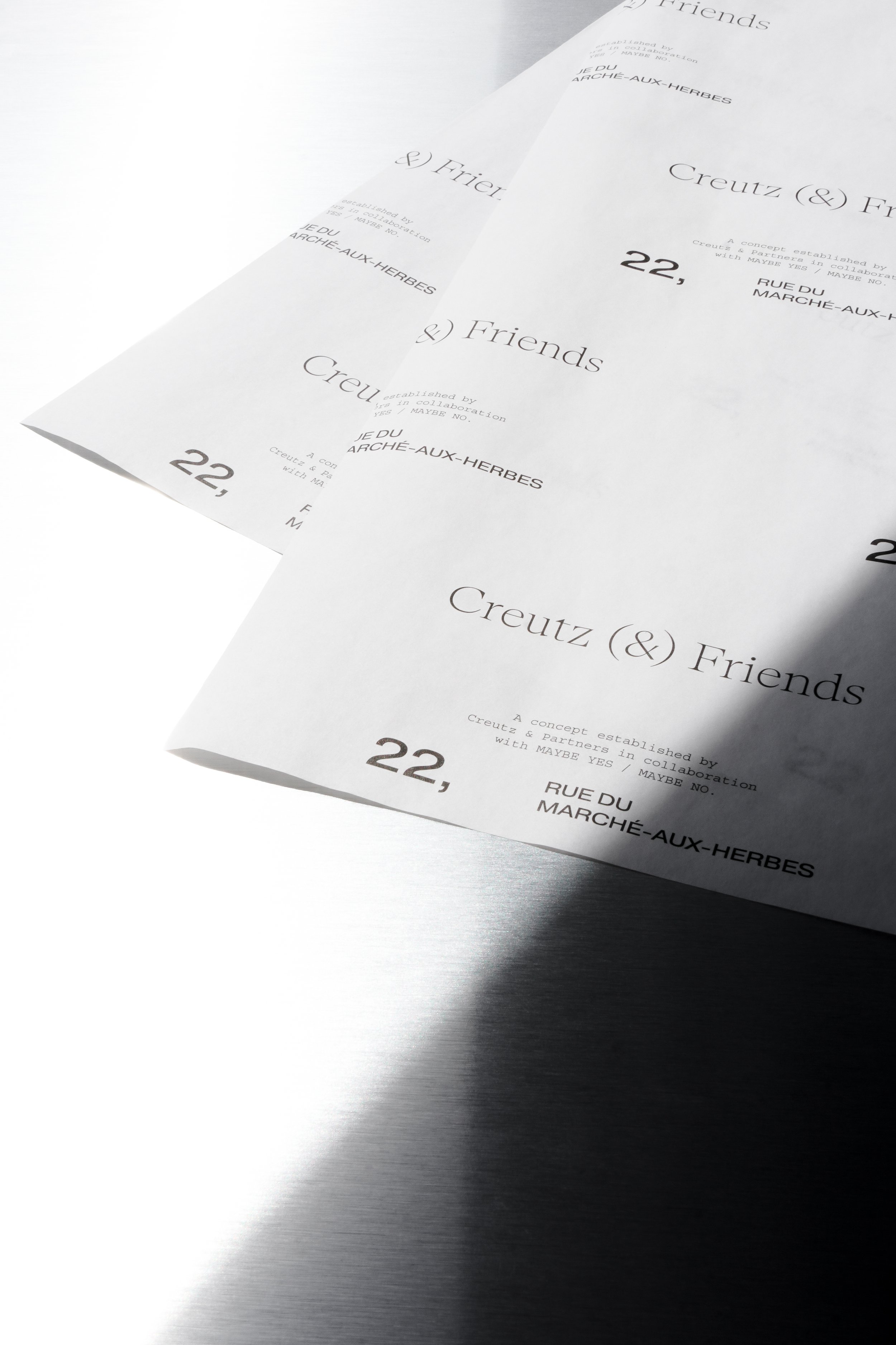
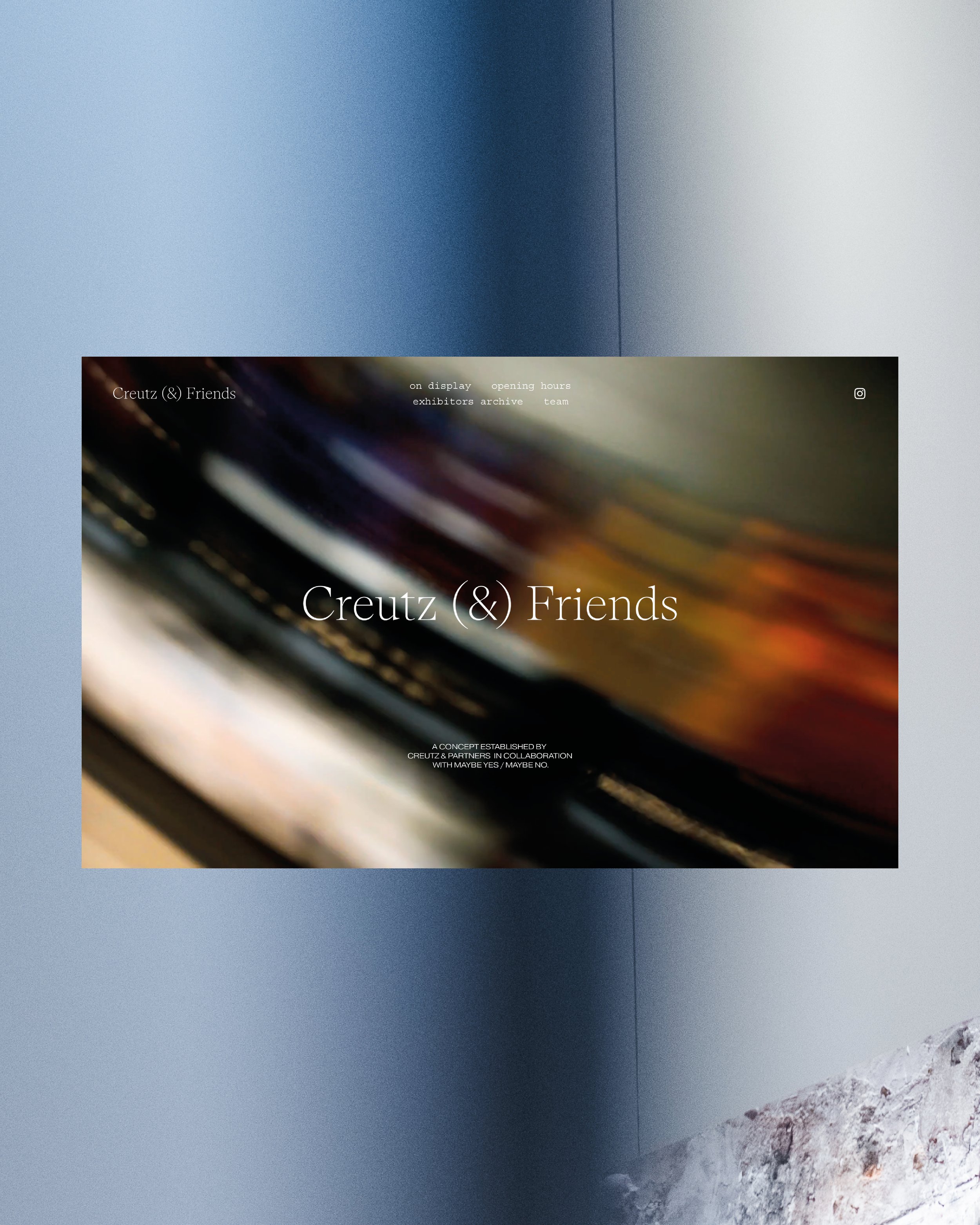
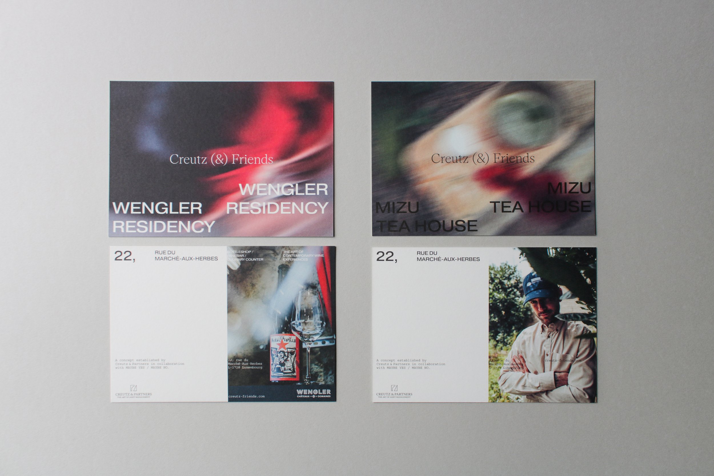
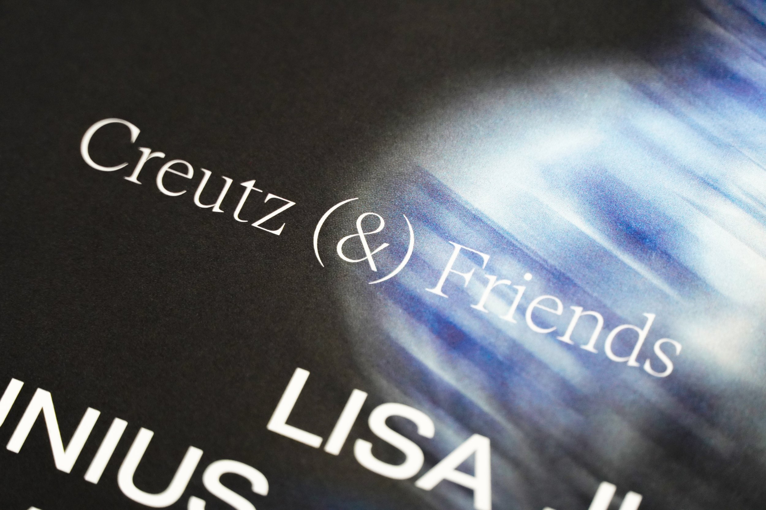
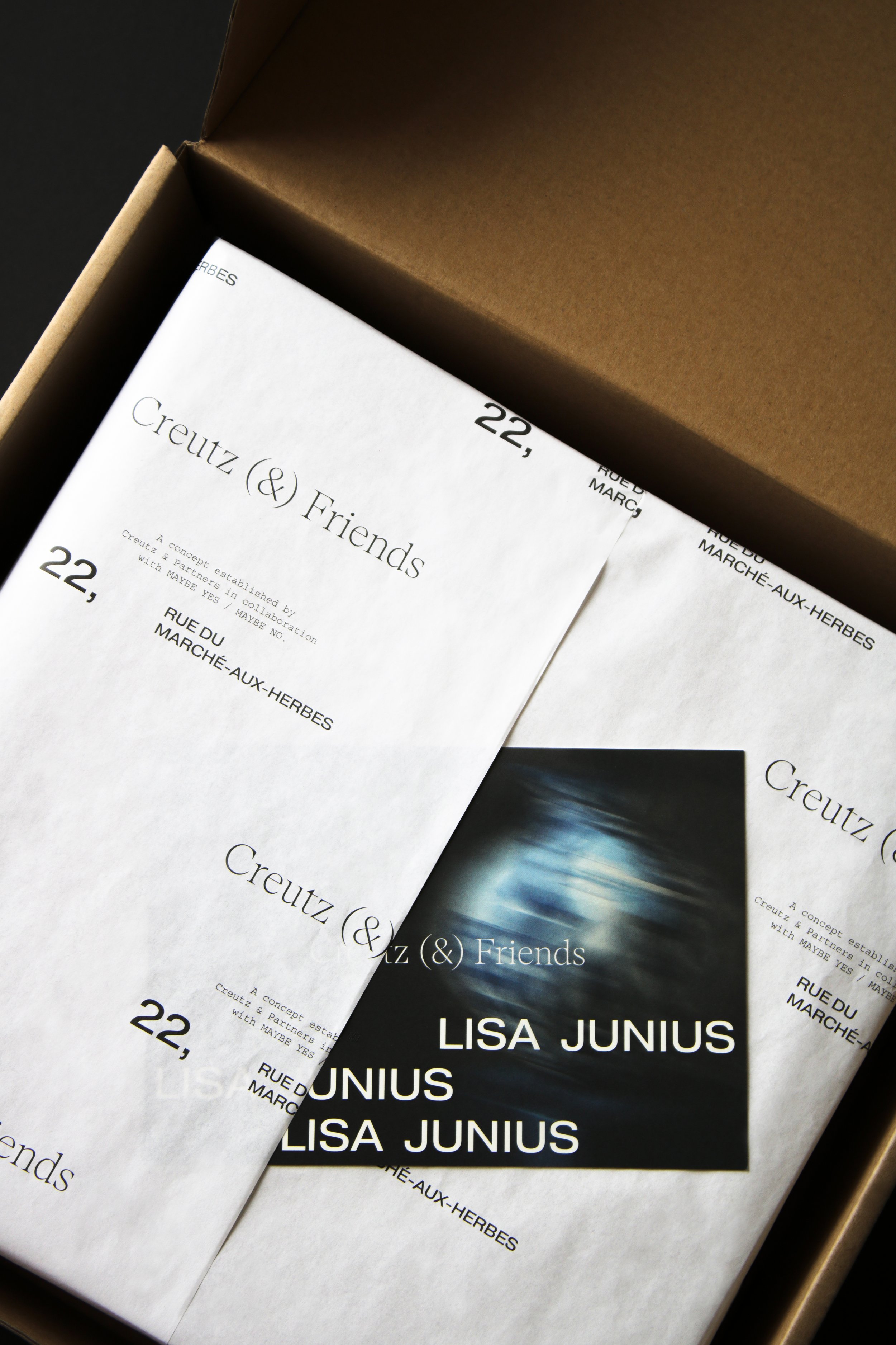
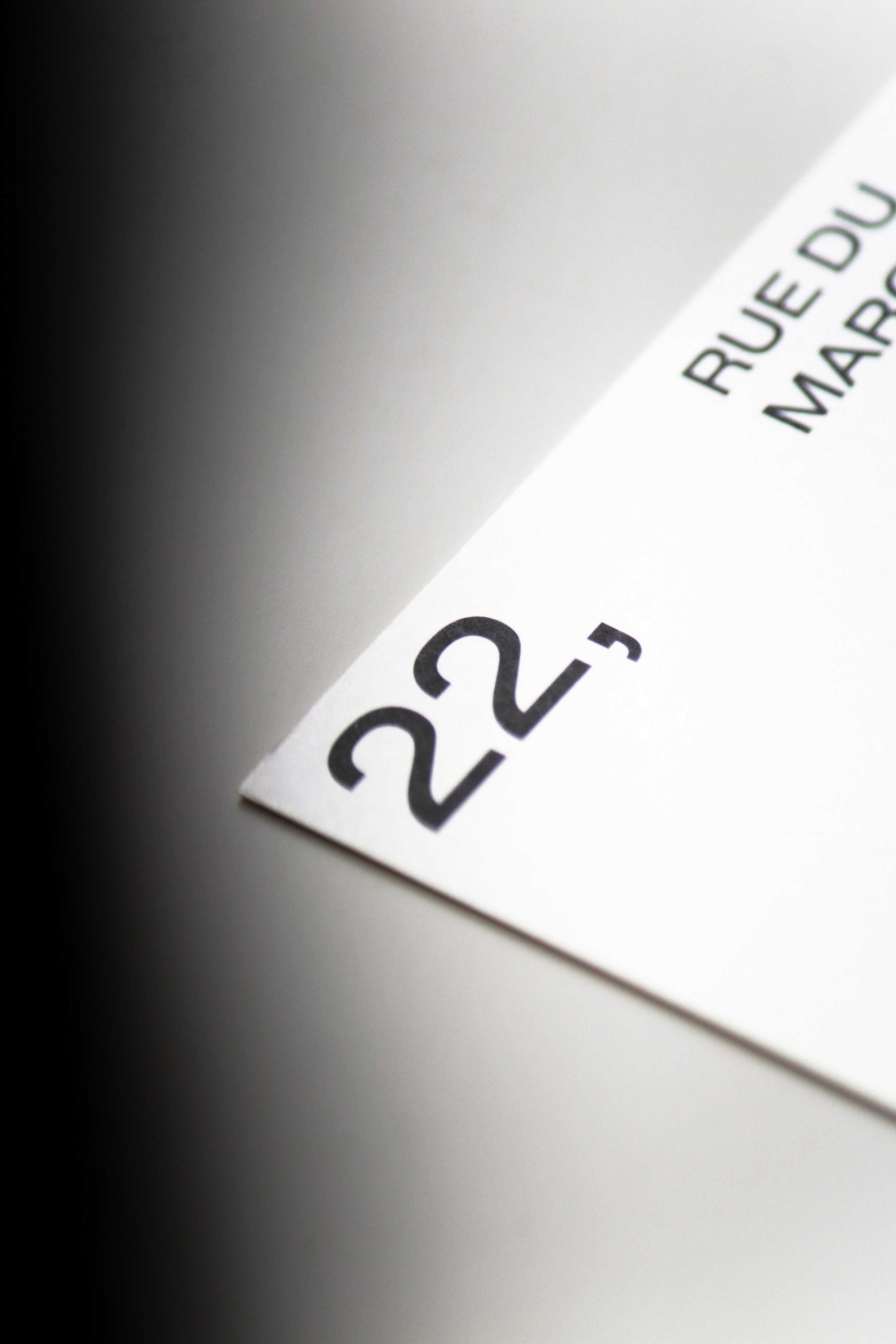
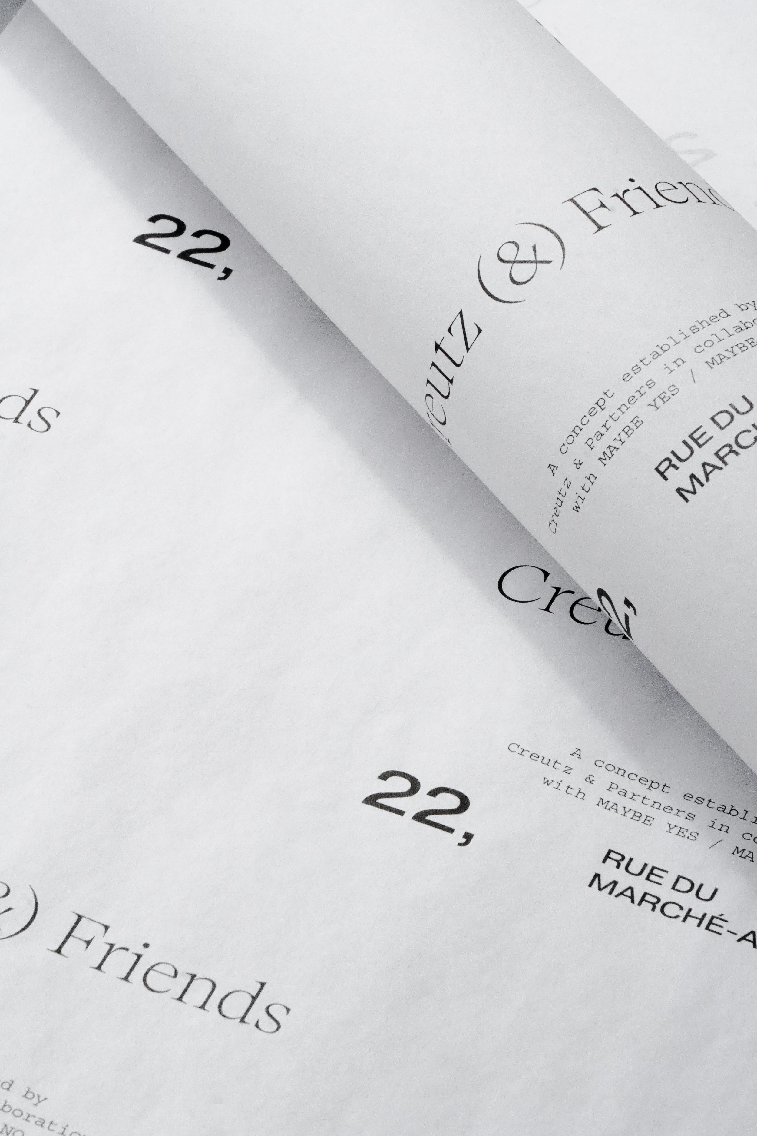
The idea was to transfer this interplay of styles to the graphic identity. In this regard, the logo of Creutz (&) Friends, with its classic serif font, aligns with the original materials while complemented with a sans-serif font representing the modern, added elements. Together, they create a strong contrast that forms the core foundation of the visual identity.
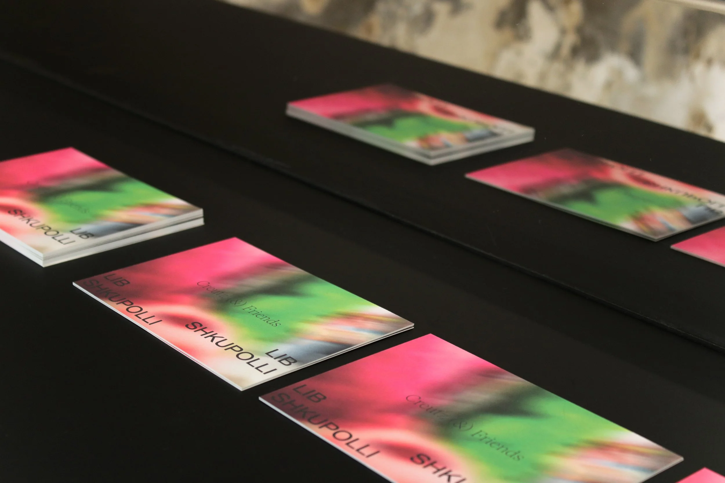
However, the overall identity should not only reflect the location and its dynamics but also provide each exhibitor with sufficient space to showcase their work within this identity.
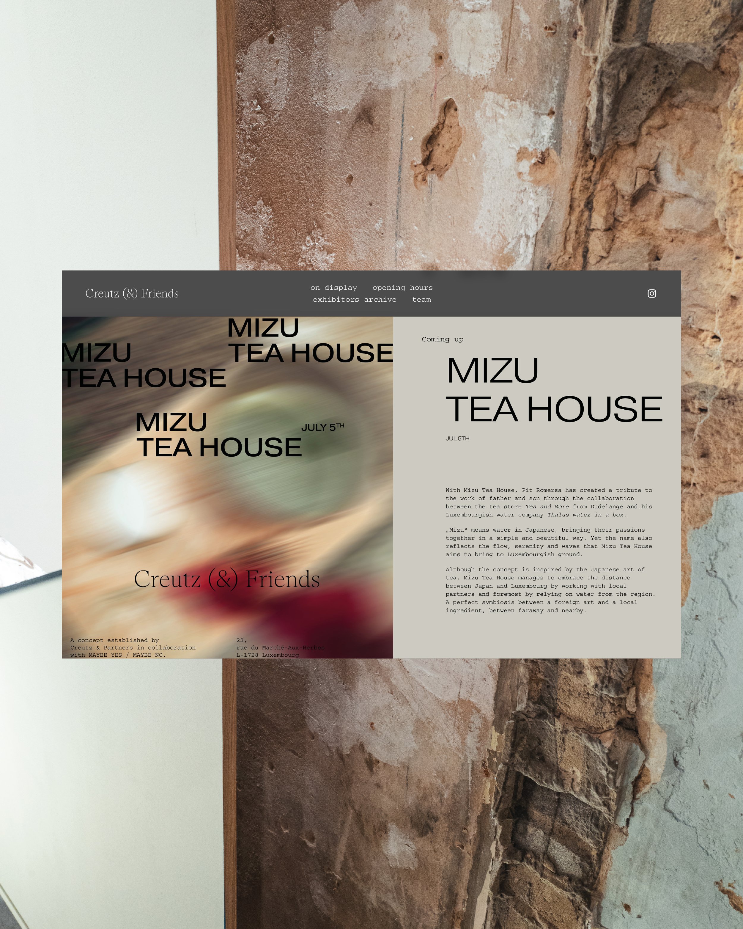
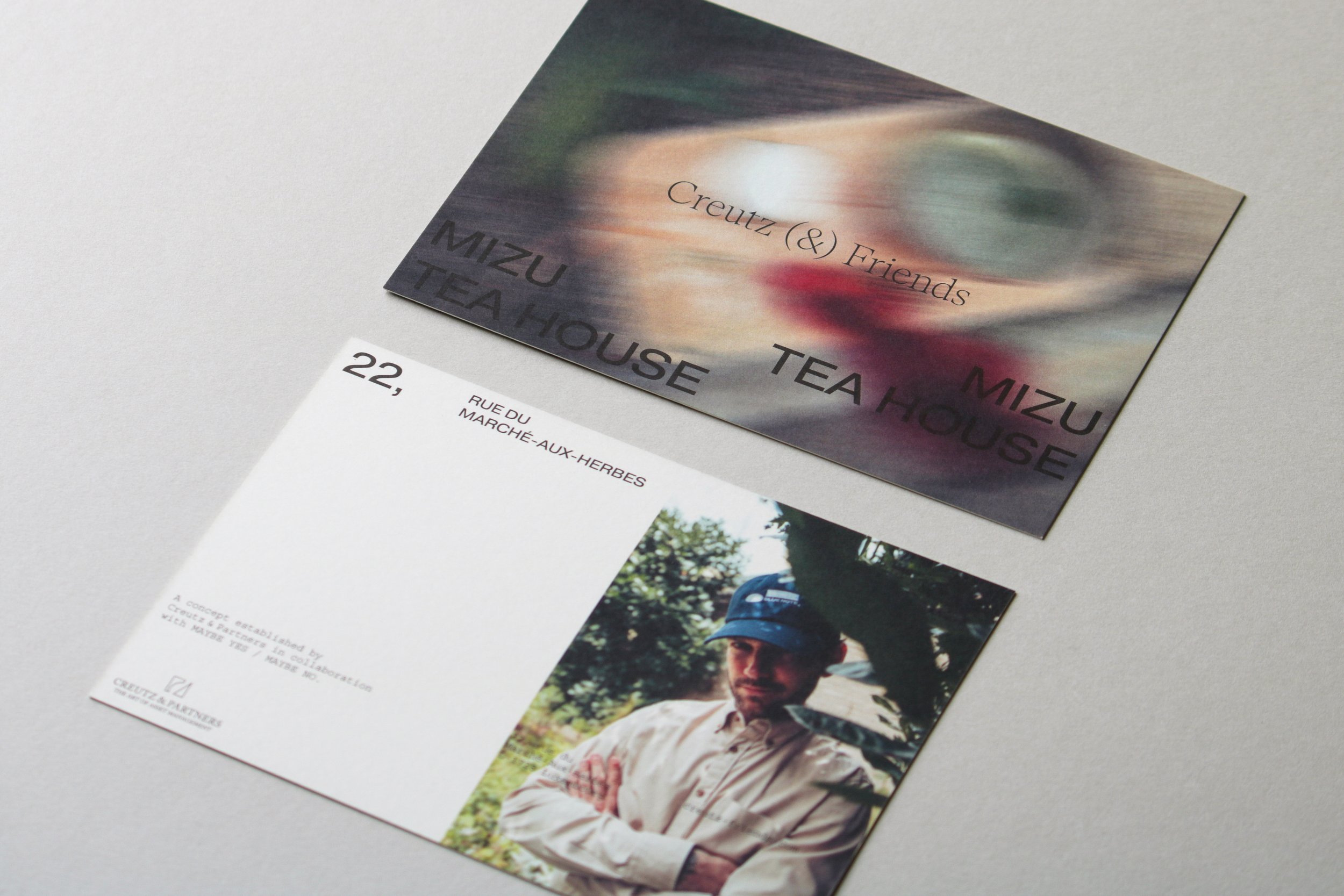
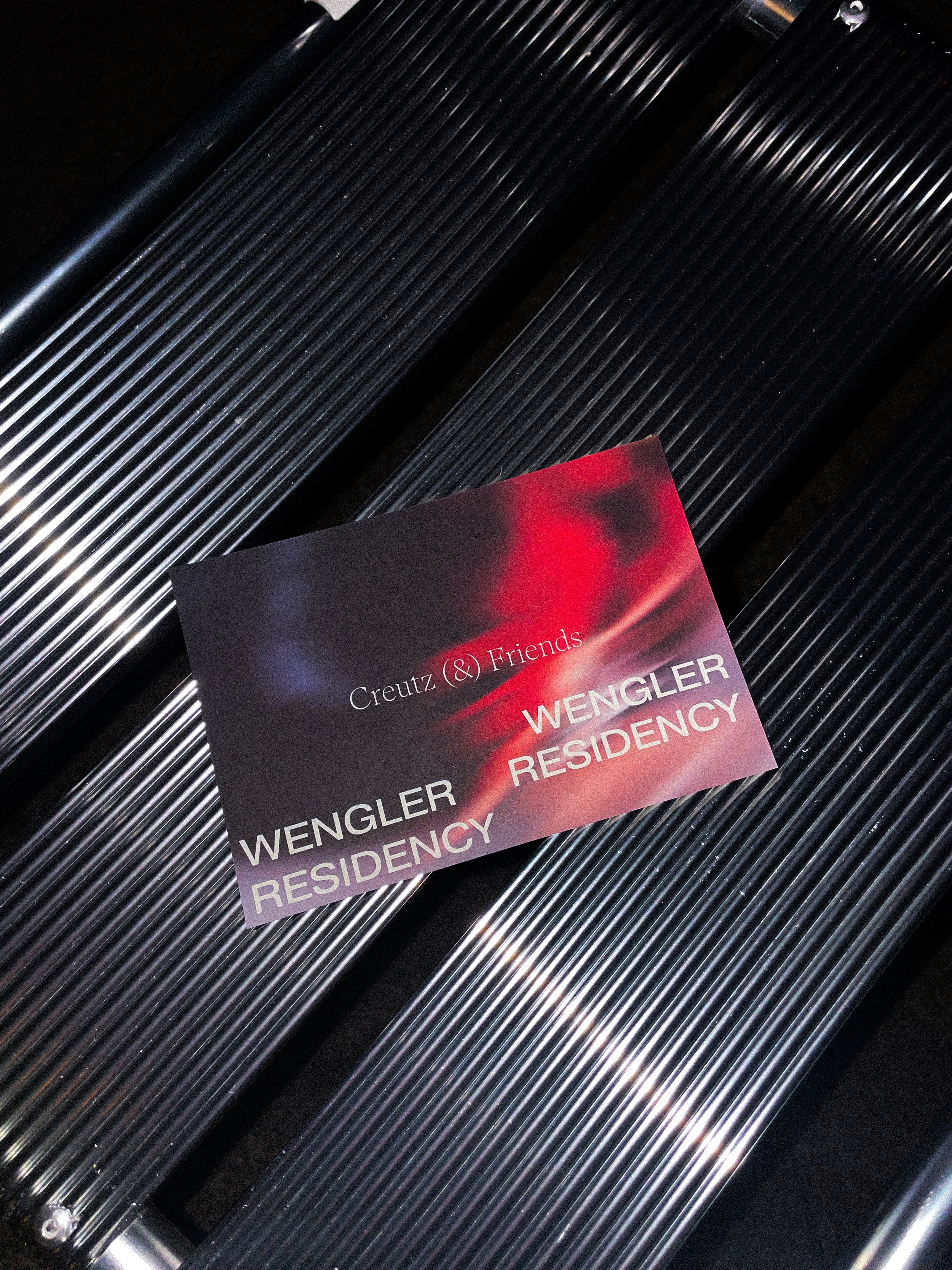
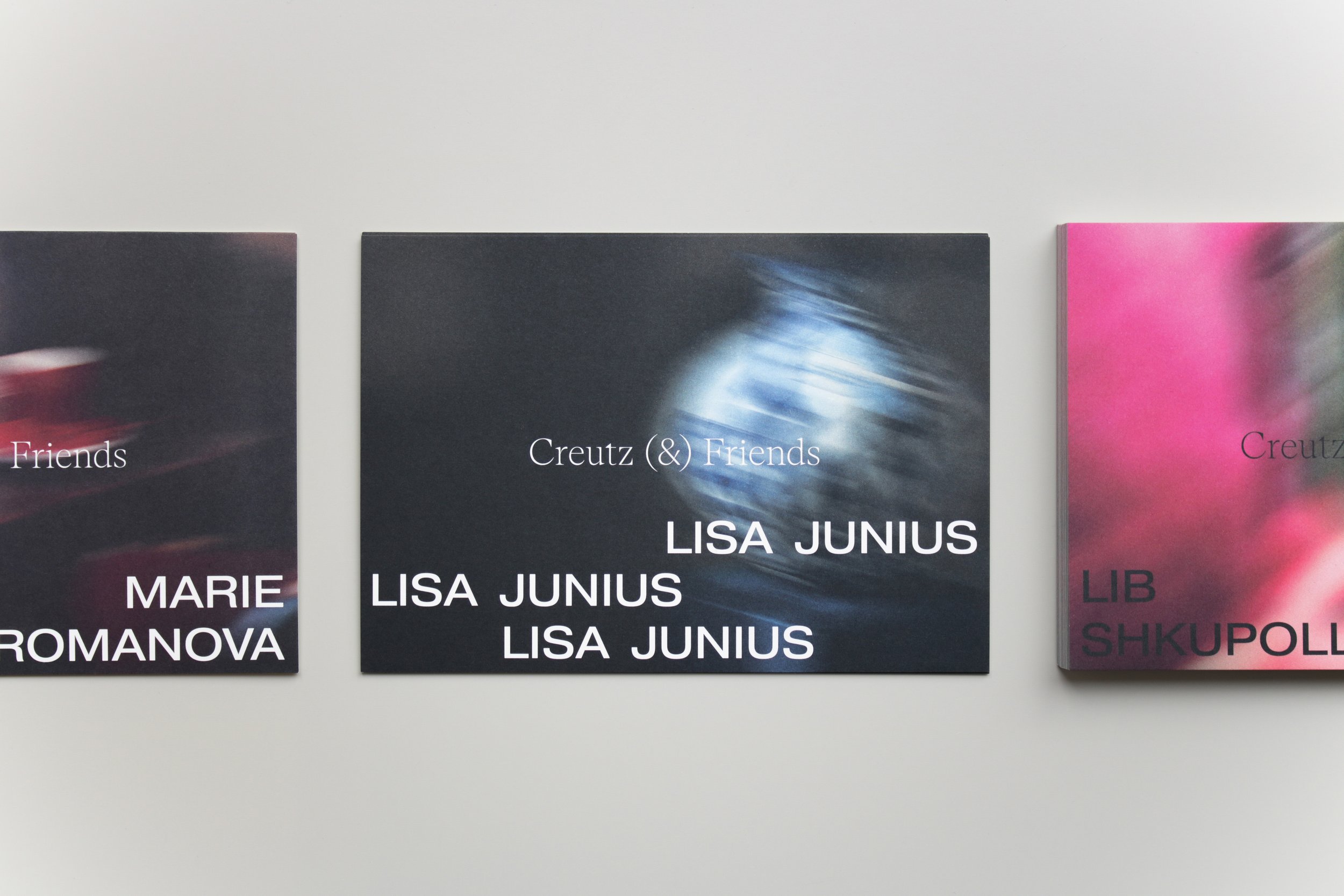
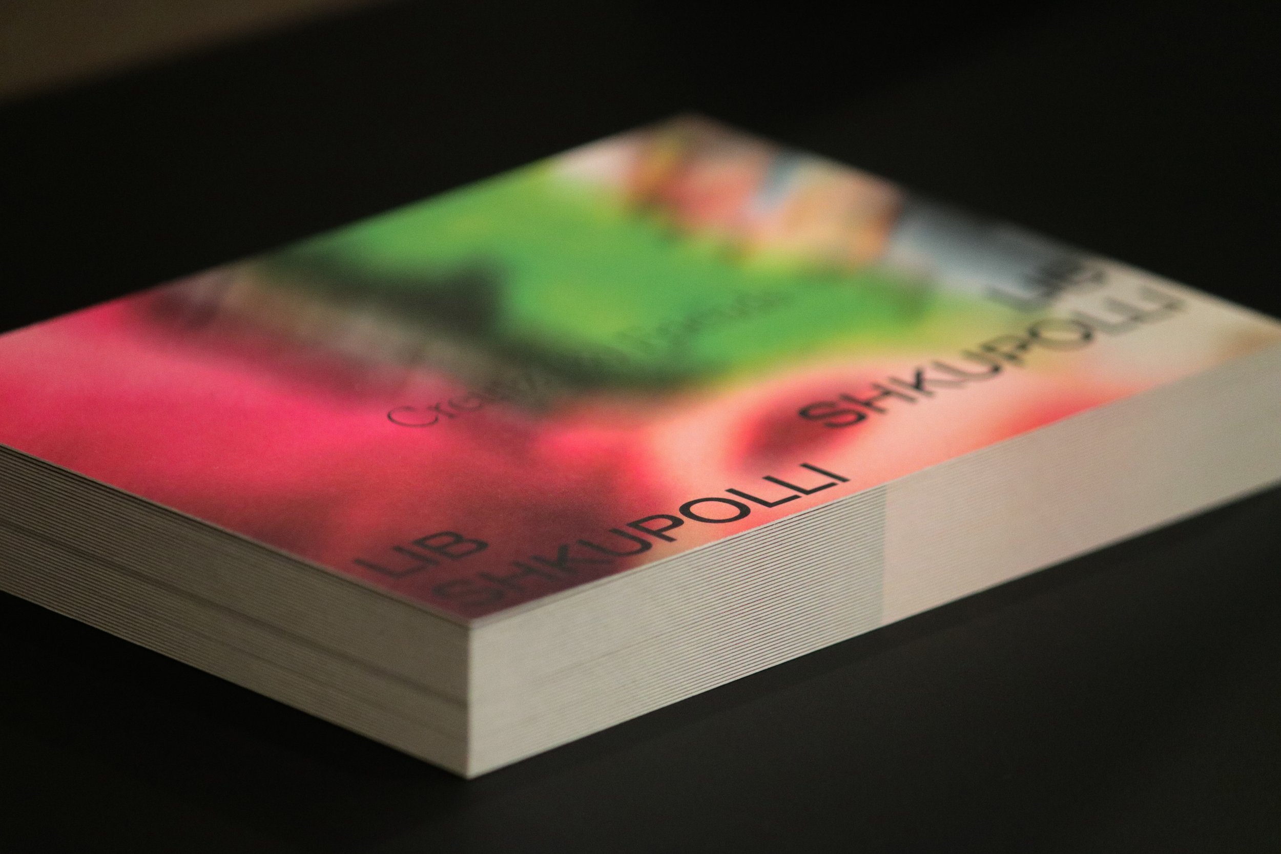
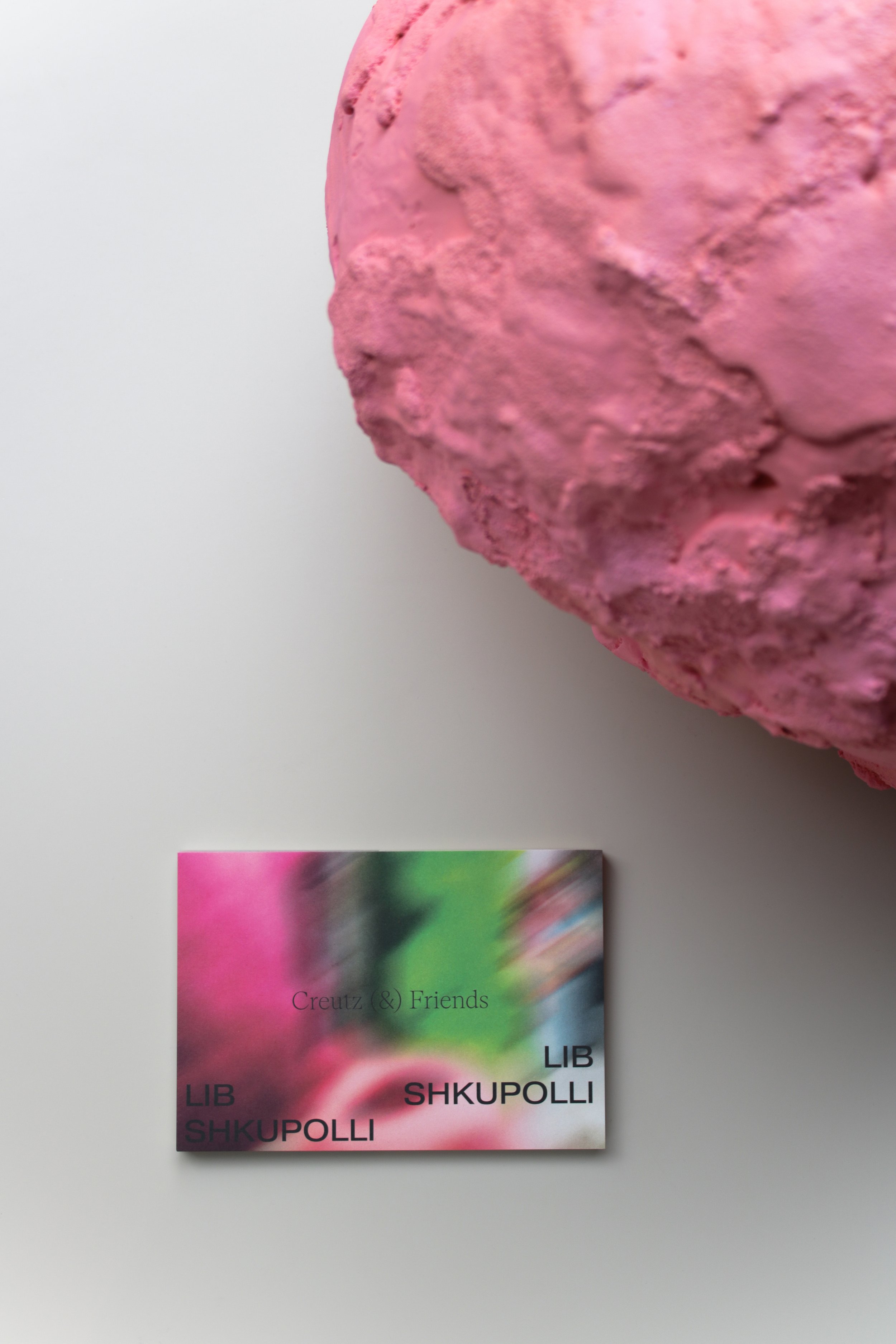
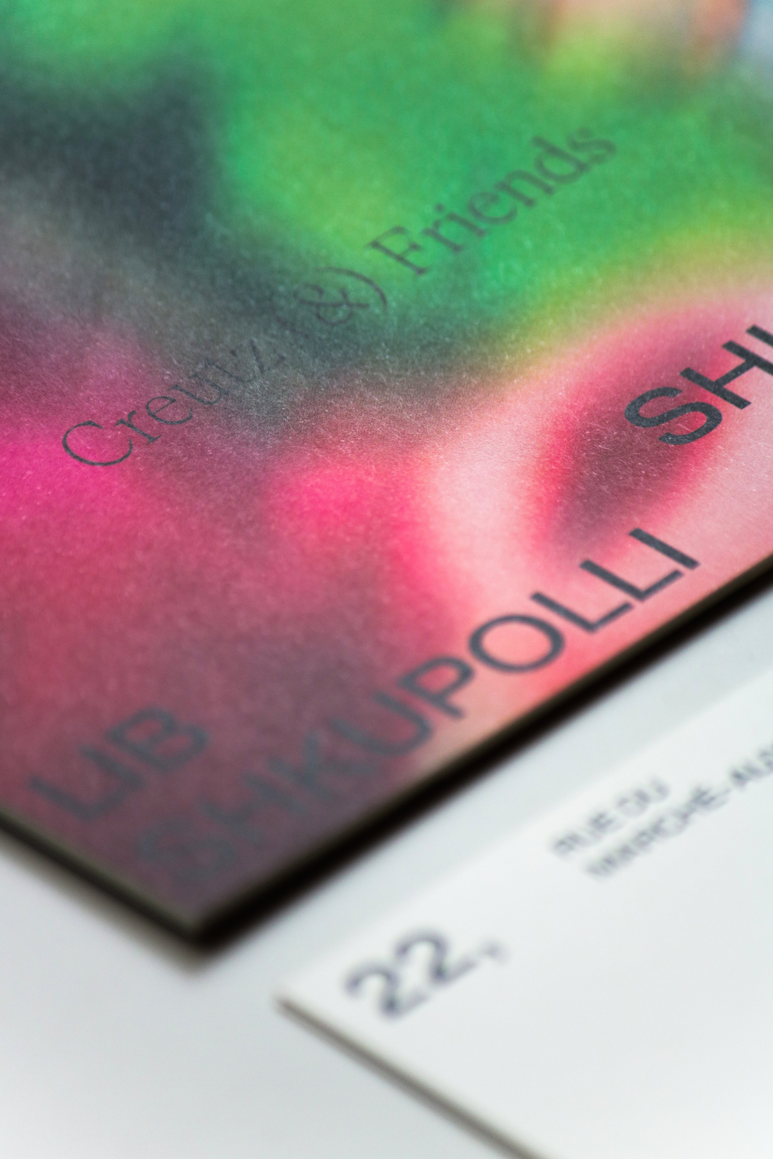
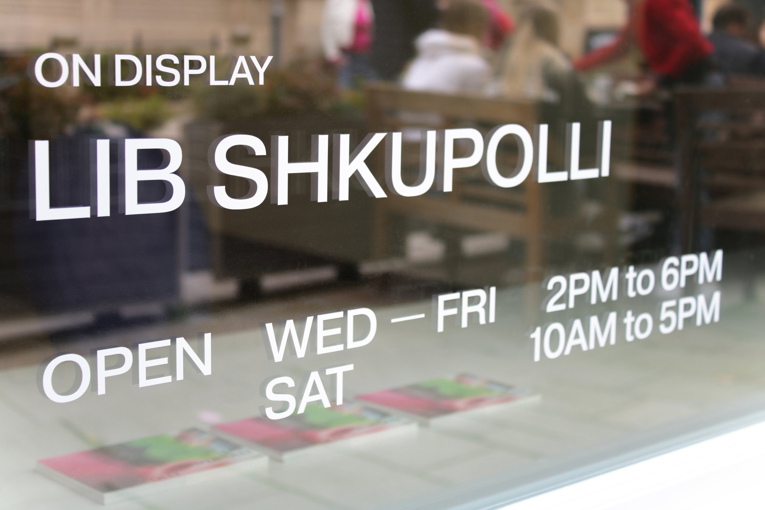
In an exhibition concept where each contributor operates in a different field, offering diverse products and embodying a unique personality, each exhibitor has already developed their own use of color and stylistic elements. For this reason, identity colors have been set aside to allow the exhibitor's own colors to take center stage in the communication. However, the placement of lettering elements obtains even greater importance. Consistent and prominent positioning, combined with repetitive elements, establishes a strong and cohesive design.
Through this approach, Studio Abricot developed a visual language that allows exhibitors to preserve their distinct identity within the overall exhibition frame.
„The objective of a joint project like this transcends the mere presentation of individual exhibitors in isolation; rather, it aspires to forge a collective identity standing for something greater.“
